Case Study
Blog-of-Thought | Product Design Case Study
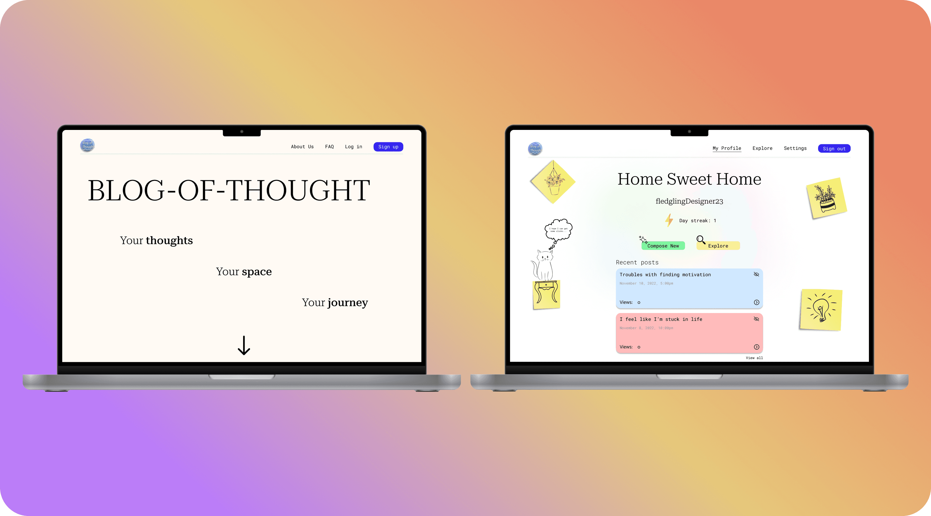
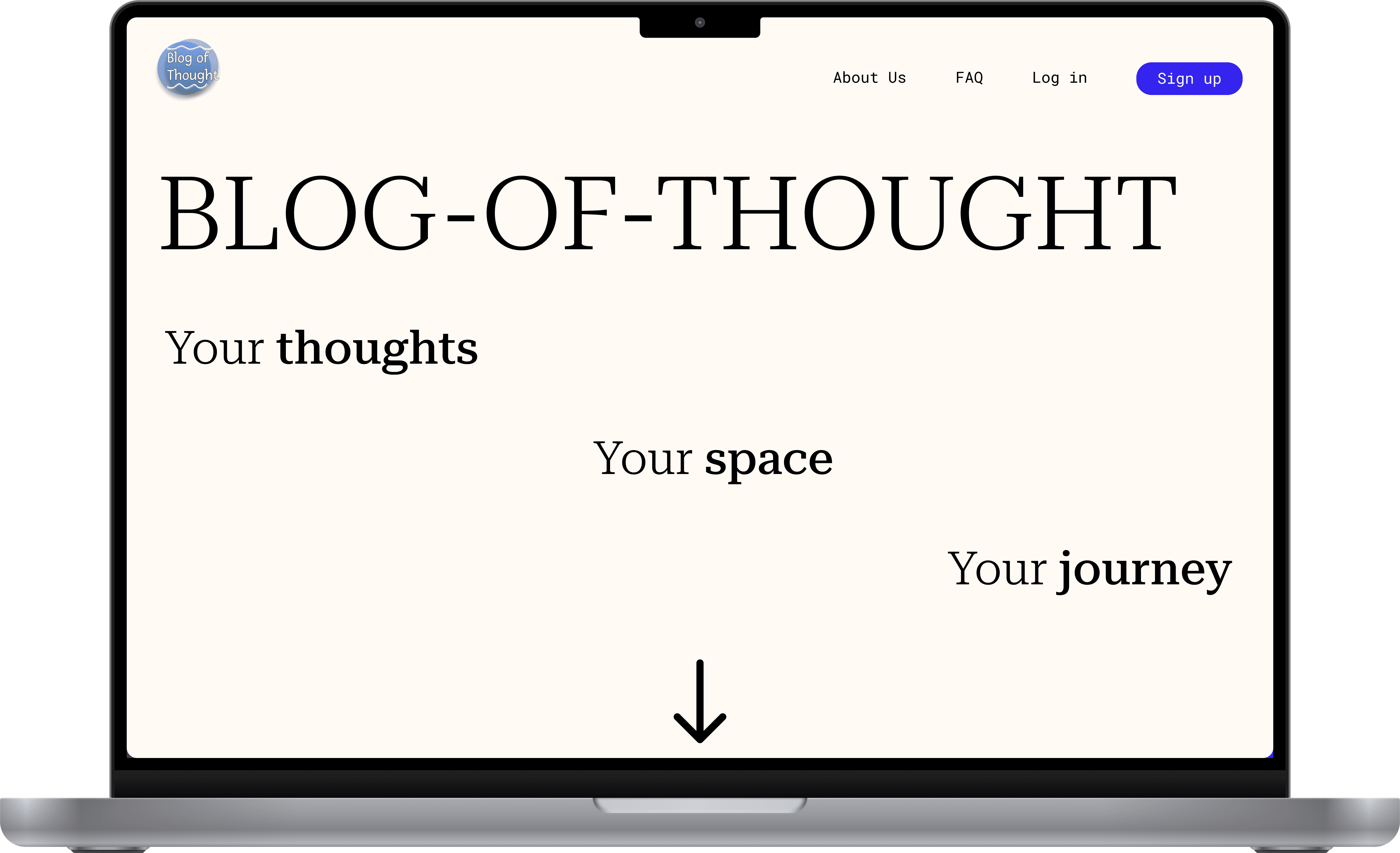
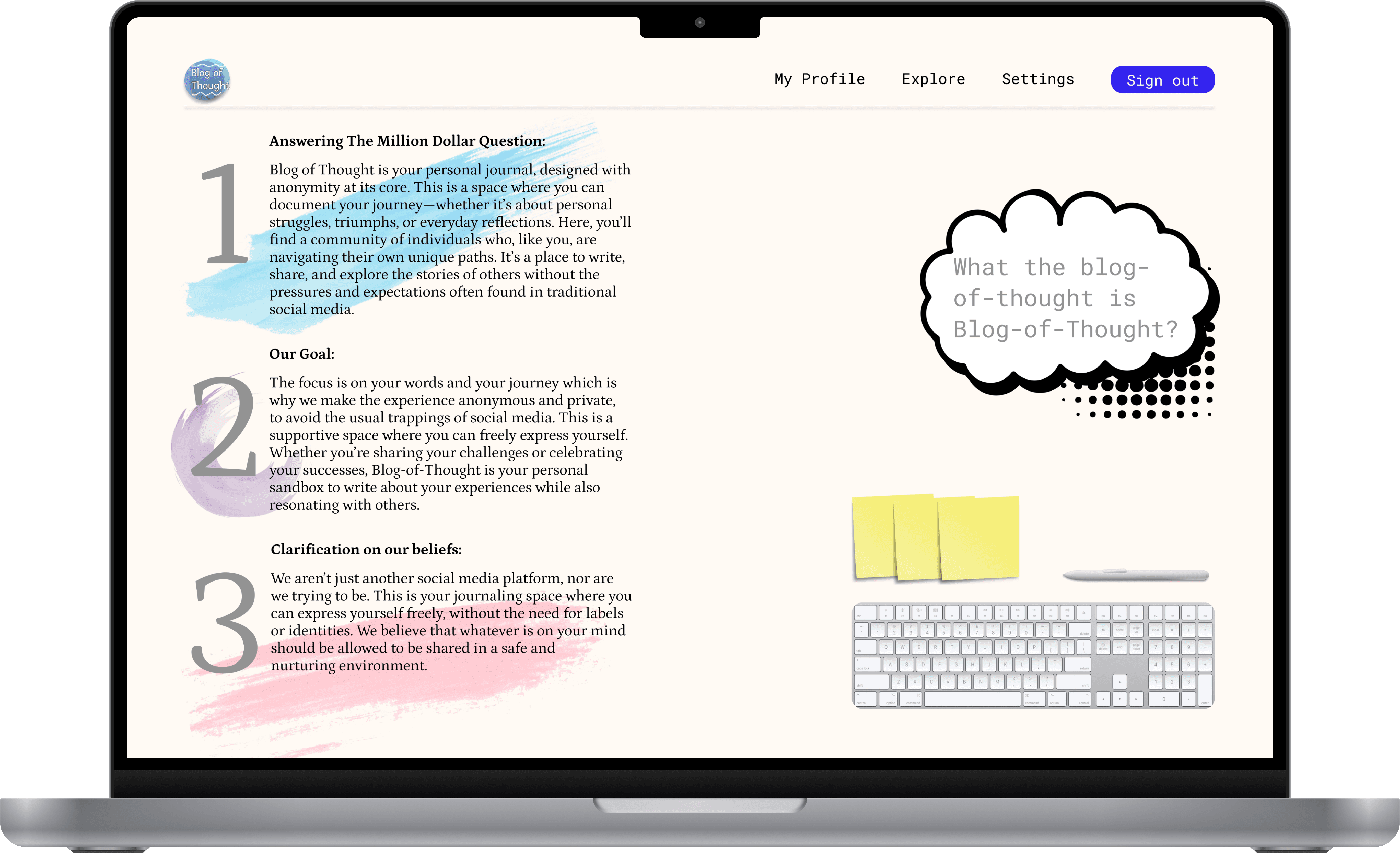
A unique blogging experience with the heart of the user and their personal journey at the forefront.

Challenge
In our software engineering course, we worked in teams of six, each with different roles, to develop a product using an agile framework. Our team chose to create a journaling-focused blogging website.
The challenge was to design a platform that avoided the typical pressures of social media—followers, comments, and likes—allowing users to focus on personal reflection. We aimed to create a space where users could write for themselves, free from external pressures, and feel that their words mattered without the burden of identity or validation. Ultimately, we wanted a platform where users could anonymously share their personal journeys, feeling heard without the baggage of traditional blogging or social media.
Results
Blog of Thought successfully delivered a secure platform for users to express their thoughts freely, without social media constraints. Frequent usability tests with six stakeholders and feedback from our TA instructor guided the development.
Testing showed a 85% improvement in user satisfaction with anonymity and privacy, while also, 90% of users found the interface intuitive and easy to navigate. Many appreciated the absence of traditional social media elements.
The design’s focus on anonymity and simplicity allowed users to journal without concerns about audience expectations or identity exposure.
Design Process
Research & Analysis
We began with exploring the psychology of journaling and blogging, noting that while journaling is often a tool for personal catharsis, attaching one's name or audience can shift the focus toward external validation. This shift undermines the mental health benefits of self-reflection, prompting us to prioritize anonymity in Blog-of-Thought.
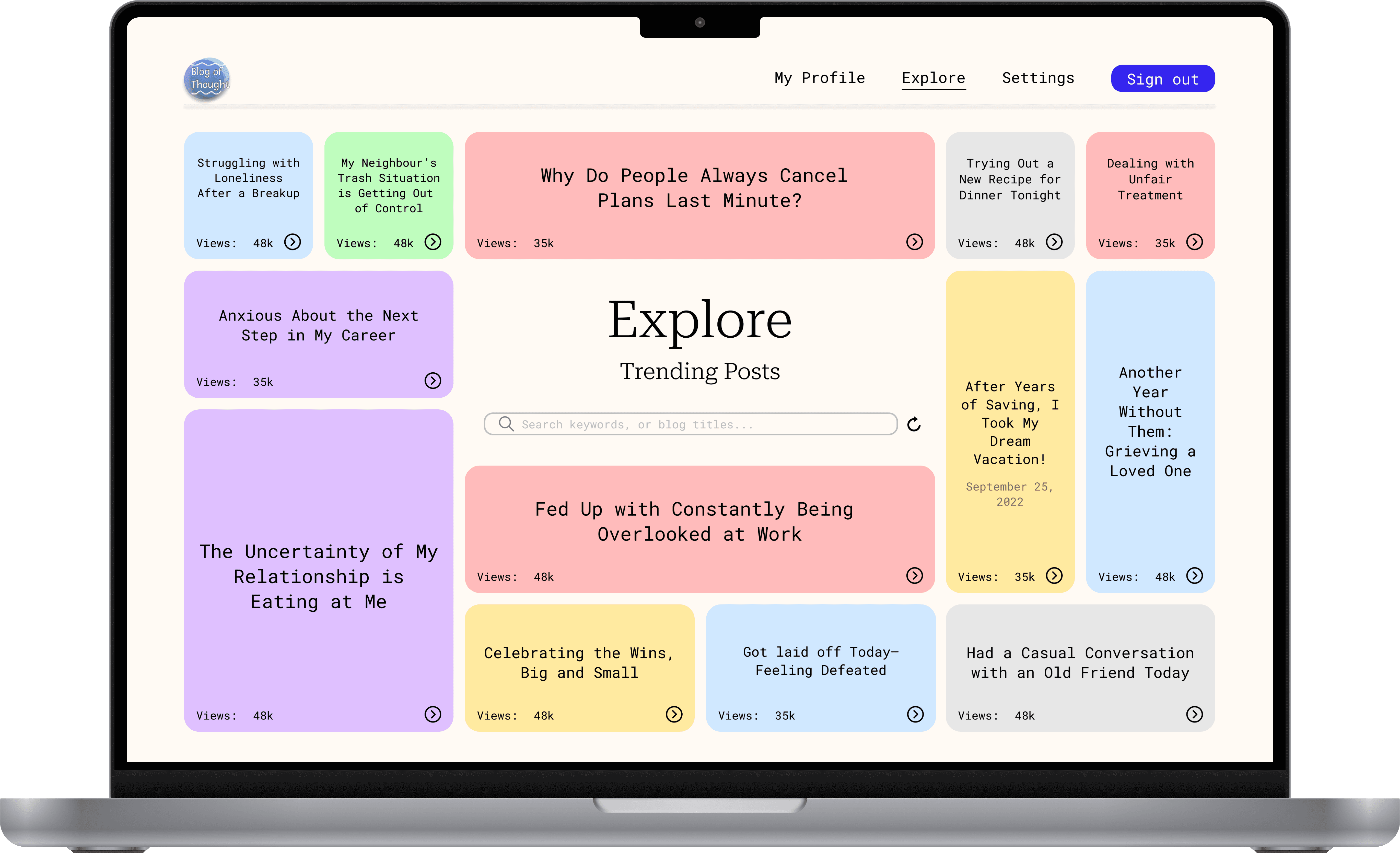
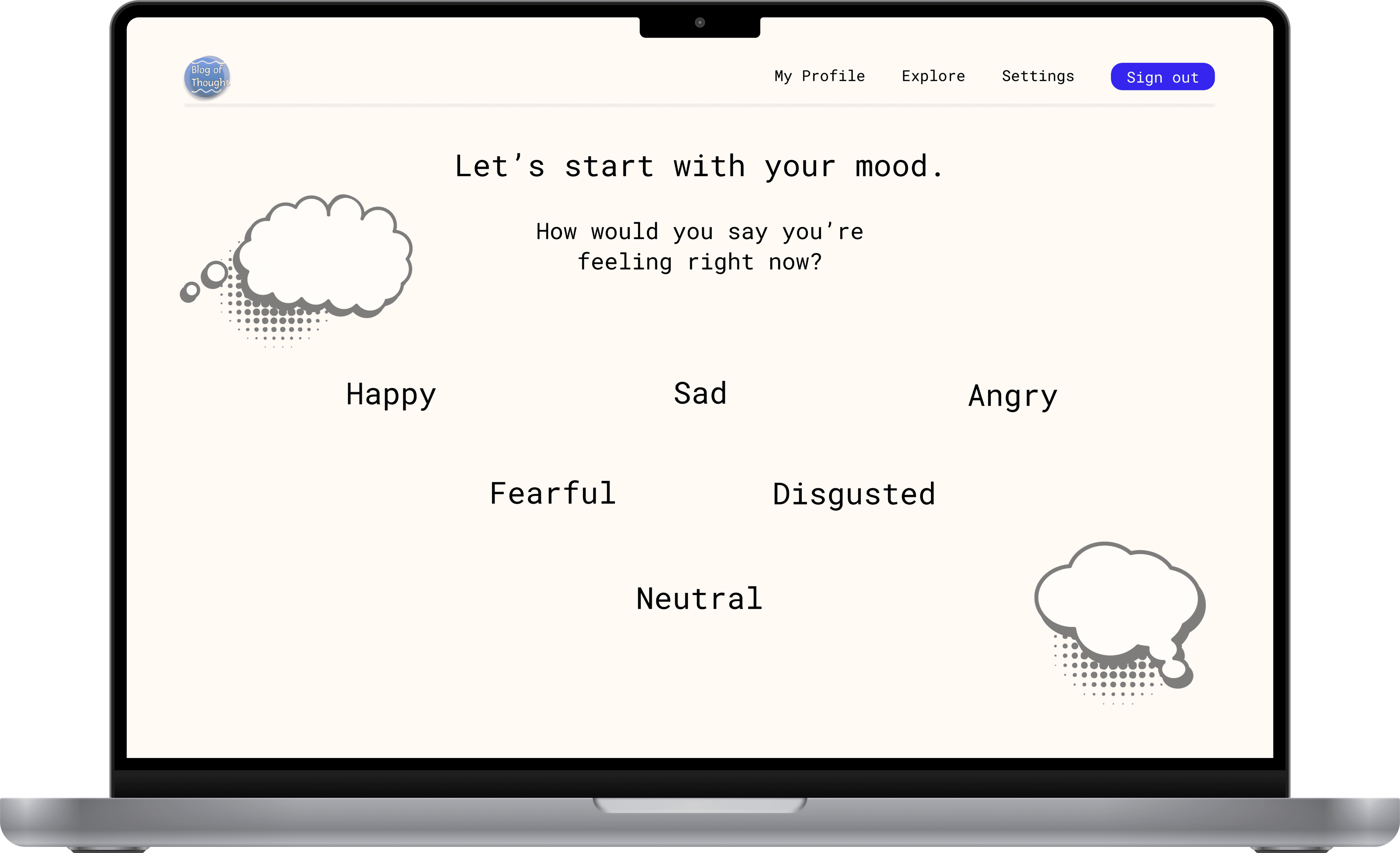
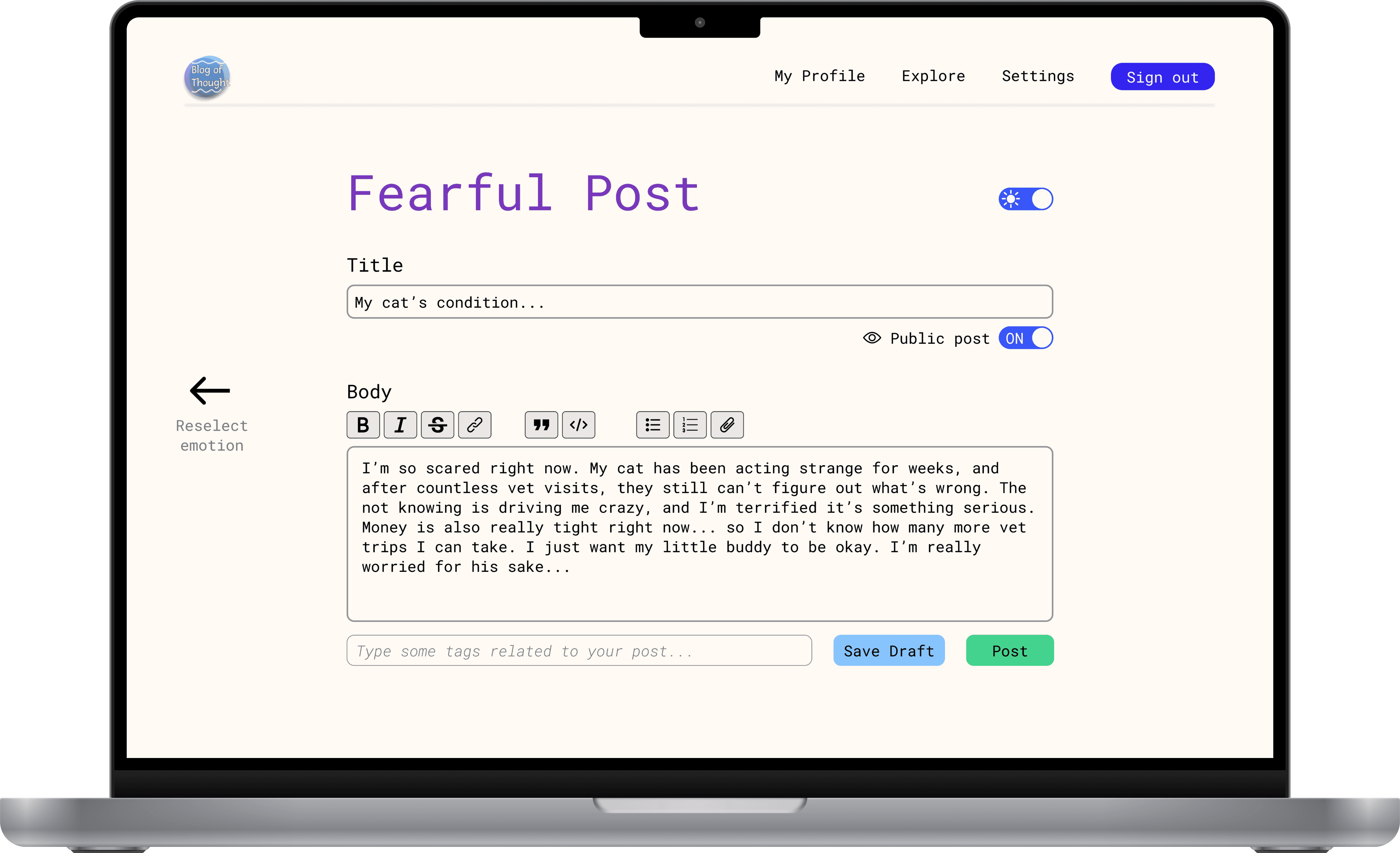
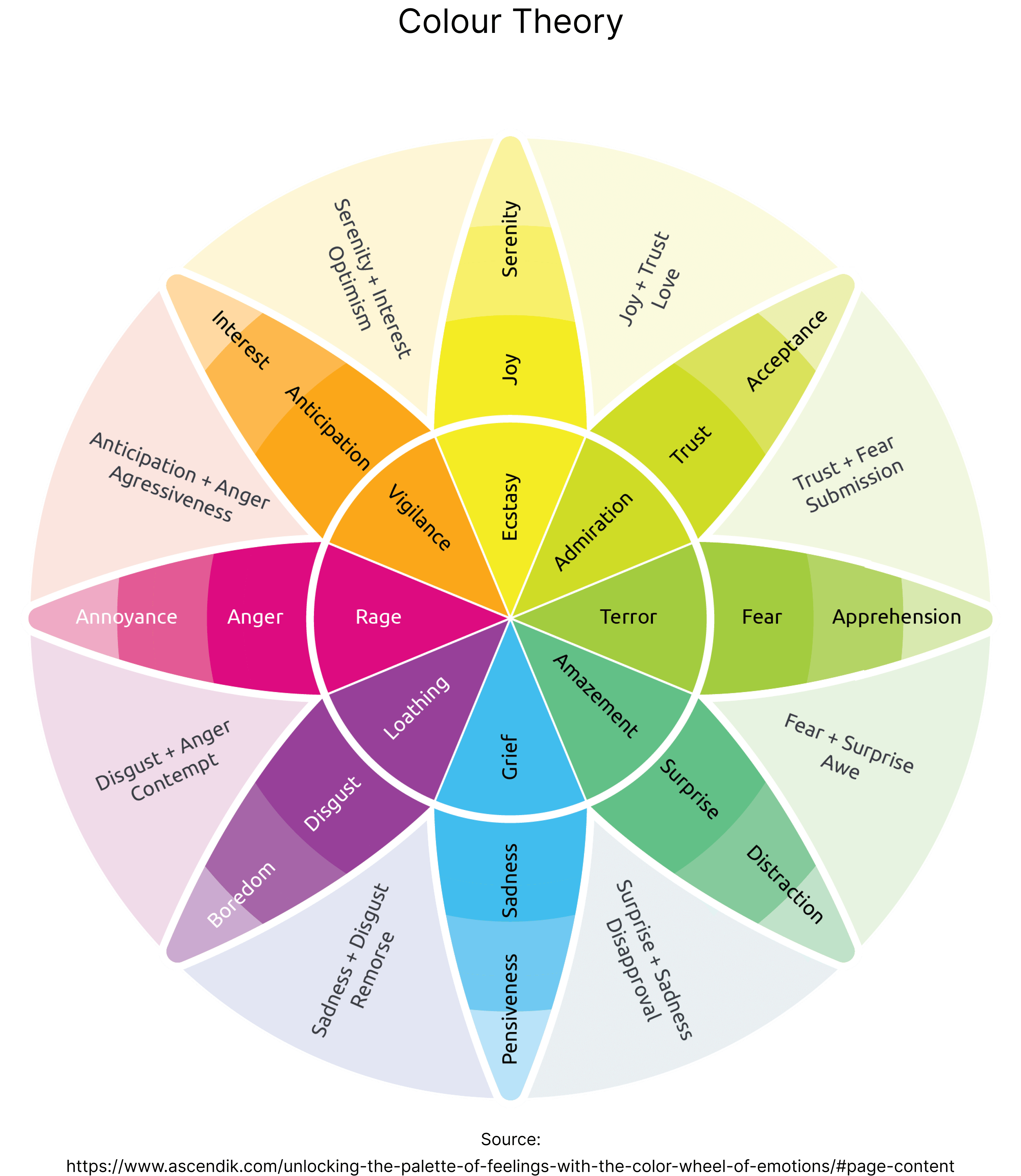
Beyond anonymity, We studied colour theory and the psychology of shapes and how they interconnect to human emotion as a whole. Since colours and shapes are intuitively understood by the human brain, I wanted to find a way to associate blog posts with five core emotions—happiness, anger, sadness, fear, and disgust. These base emotions simplify emotional identification, (I.E.: helping users avoid overanalyzing their feelings).
Research showed that these emotions are more easily understood and thus could cover a wider range of more nuanced emotions. This approach allowed users to quickly connect their current state to one of the core emotions, making the journaling process smoother and more intuitive.
Identifying the Problem
In addition to formal research, we held ongoing conversations with our stakeholders. Through these discussions, they shared their vision for the application which helped us better understand what to develop and guided our key design decisions.
Delving deeper into user insights, we also produced an affinity map where we identified three key themes that emerged from the data collected during our research and stakeholder feedback:
Anonymity: Our stakeholders felt that removing personal identifiers allowed for more genuine, vulnerable sharing without the pressure of being judged or evaluated based on their identity.
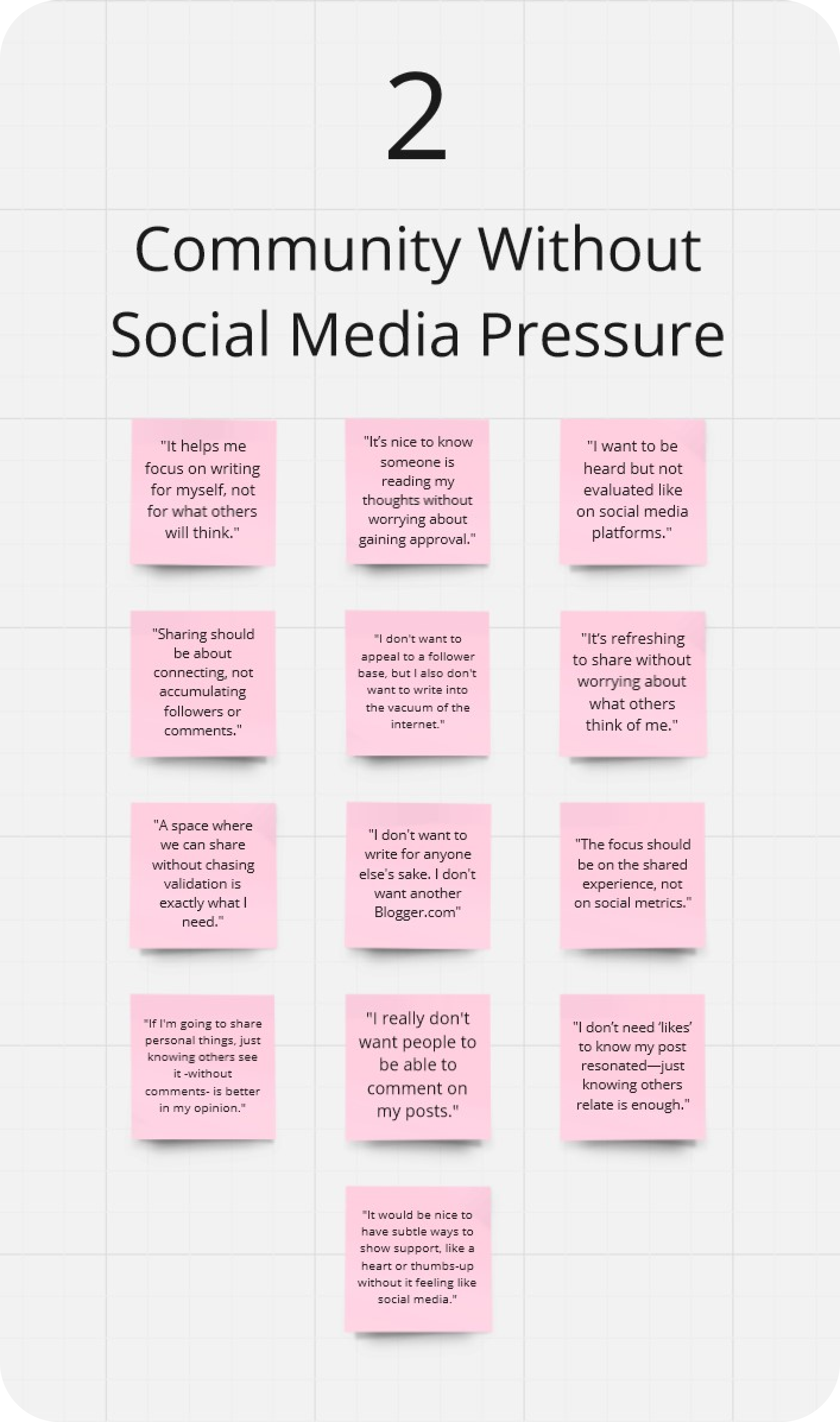
Community Without Social Media Pressure: Users wanted the benefits of community—knowing that others could read and resonate with their posts—without the standard social media mechanisms of followers, likes, and comments.
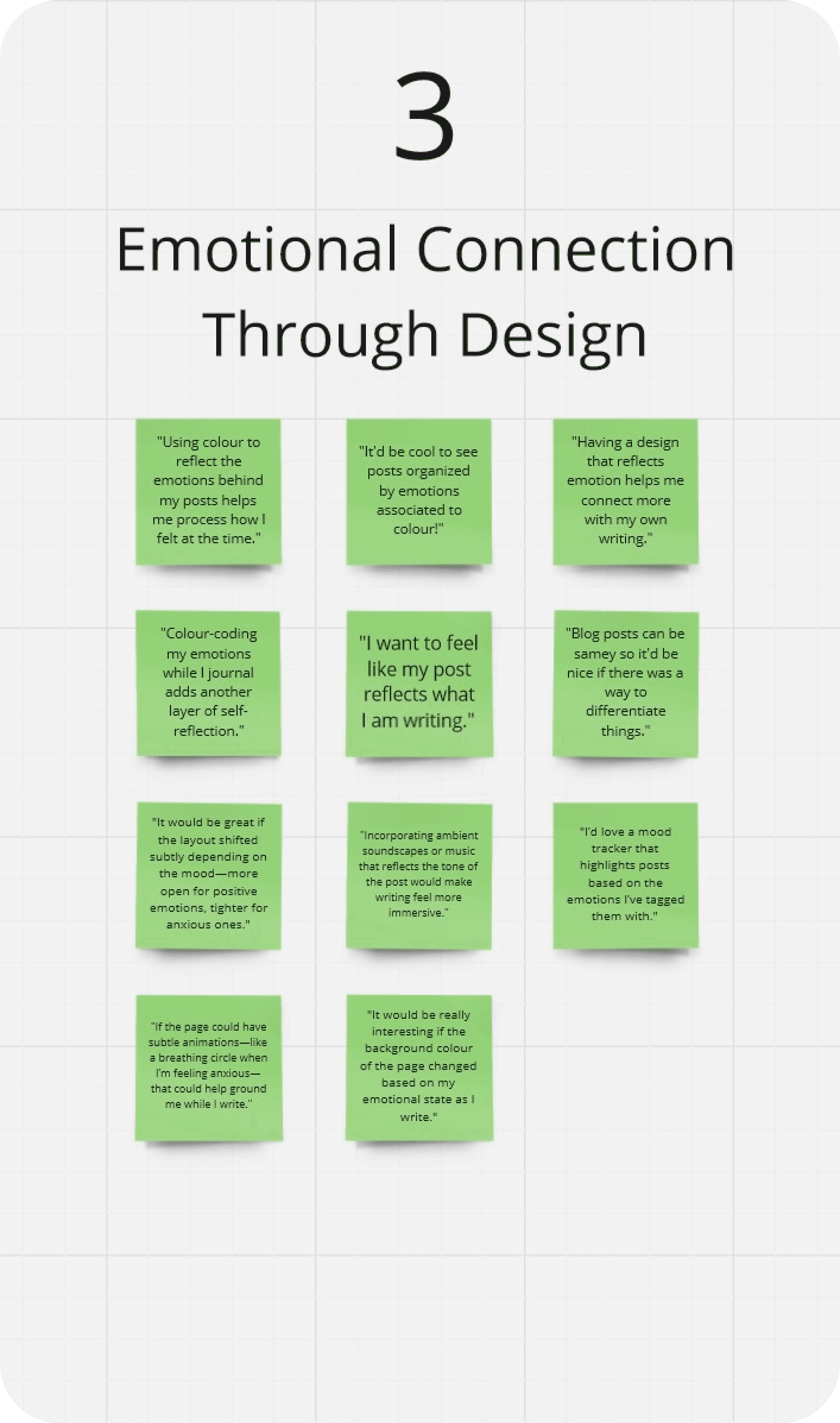
Emotional Connection Through Design: By incorporating the data collected on colour theory and shape psychology, we could incorporate these elements which would enable users to identify their emotions of their posts at a glance.
Affinity Map
Exploring Concepts & Designs
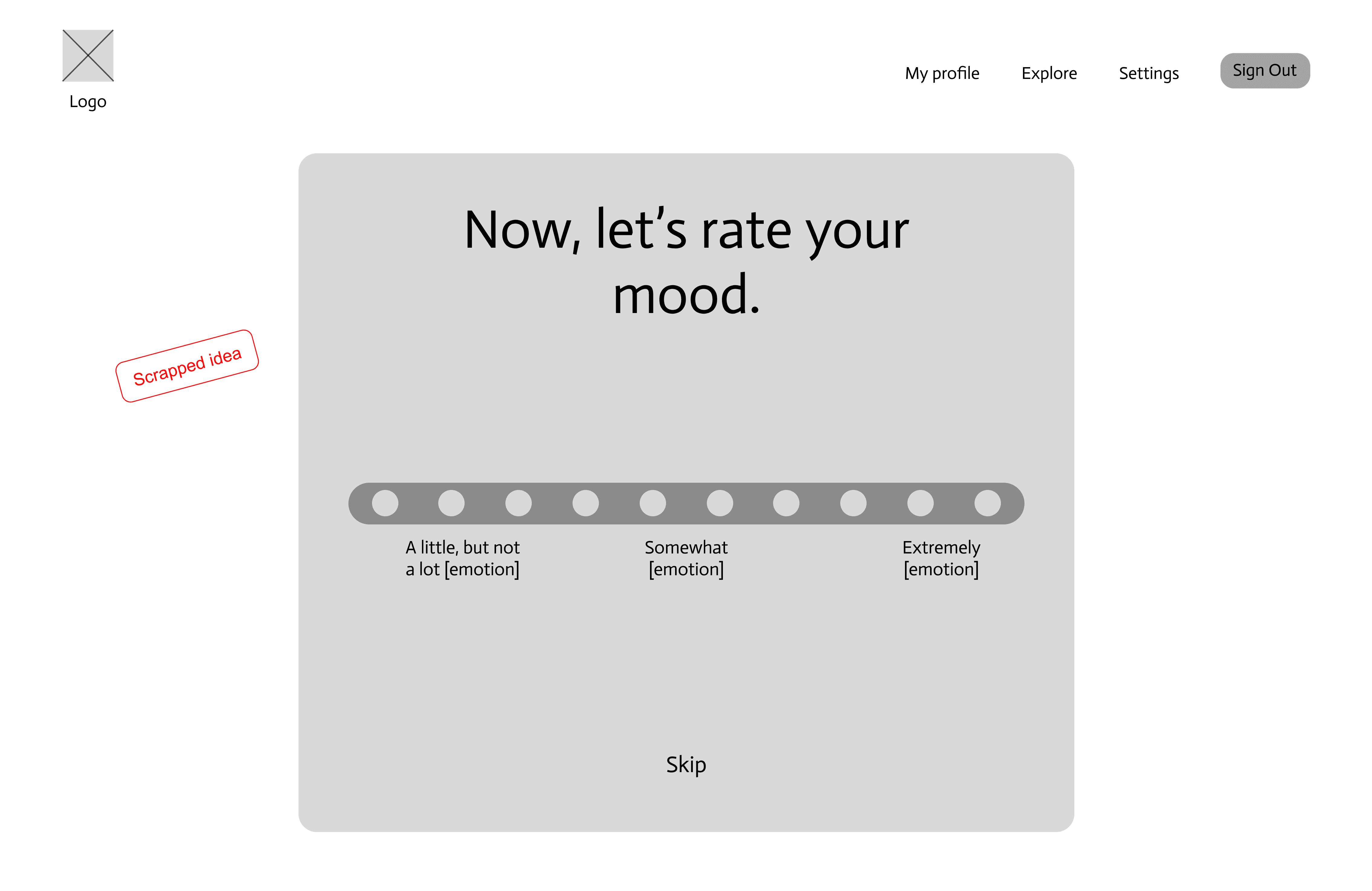
We initially experimented with a mood rating scale, but user testing revealed that stakeholders often skipped it. This confirmed our decision to simplify emotional expression using five core emotions, ultimately streamlining the writing experience.
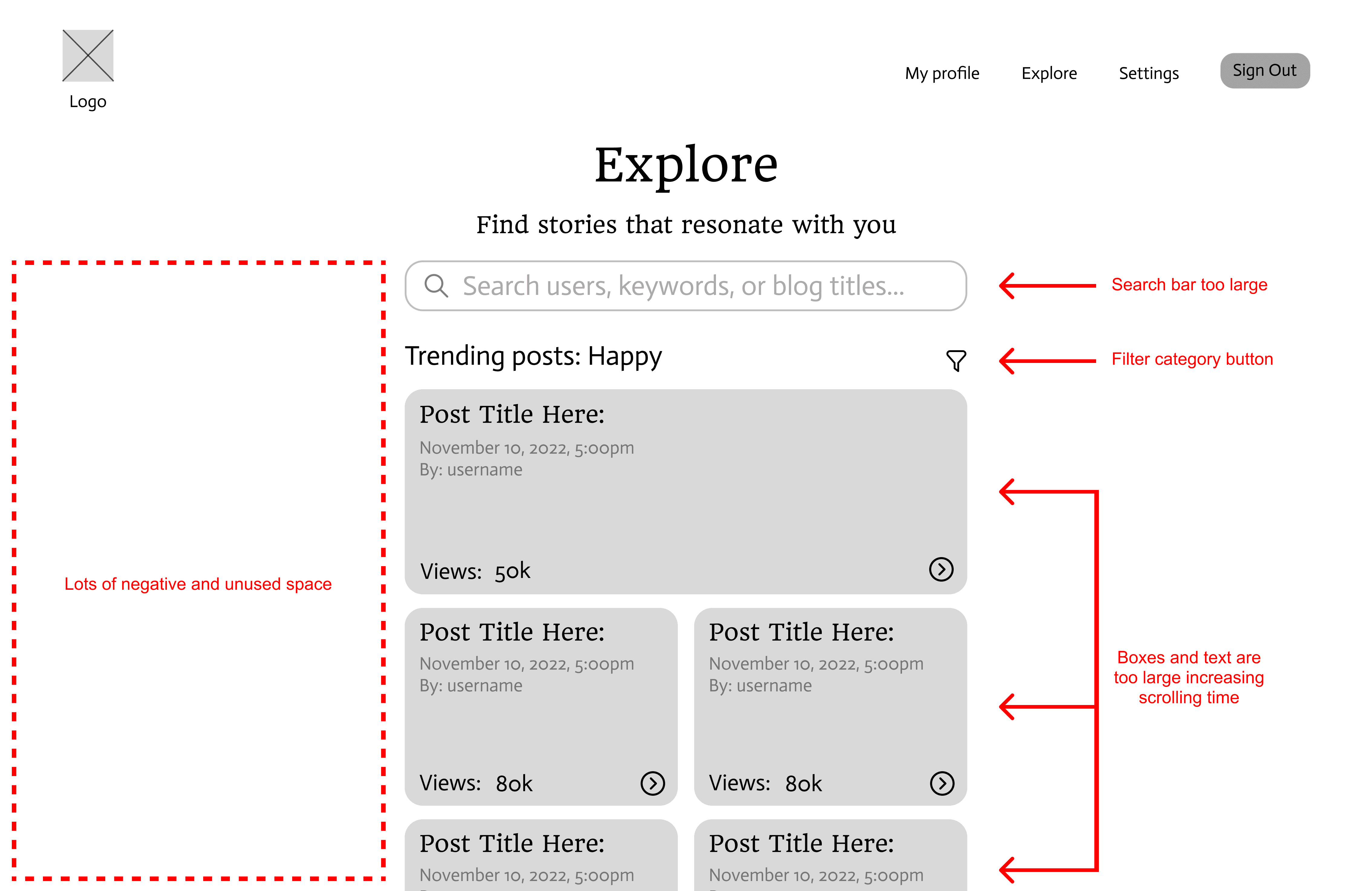
For layout, we believed a center-aligned design with extensive negative space would make exploring posts more organized. However, stakeholders found it disengaging, comparing it to "doom scrolling." In response, we tested various bento box layouts, which improved navigation but still lacked a distinct personal touch.
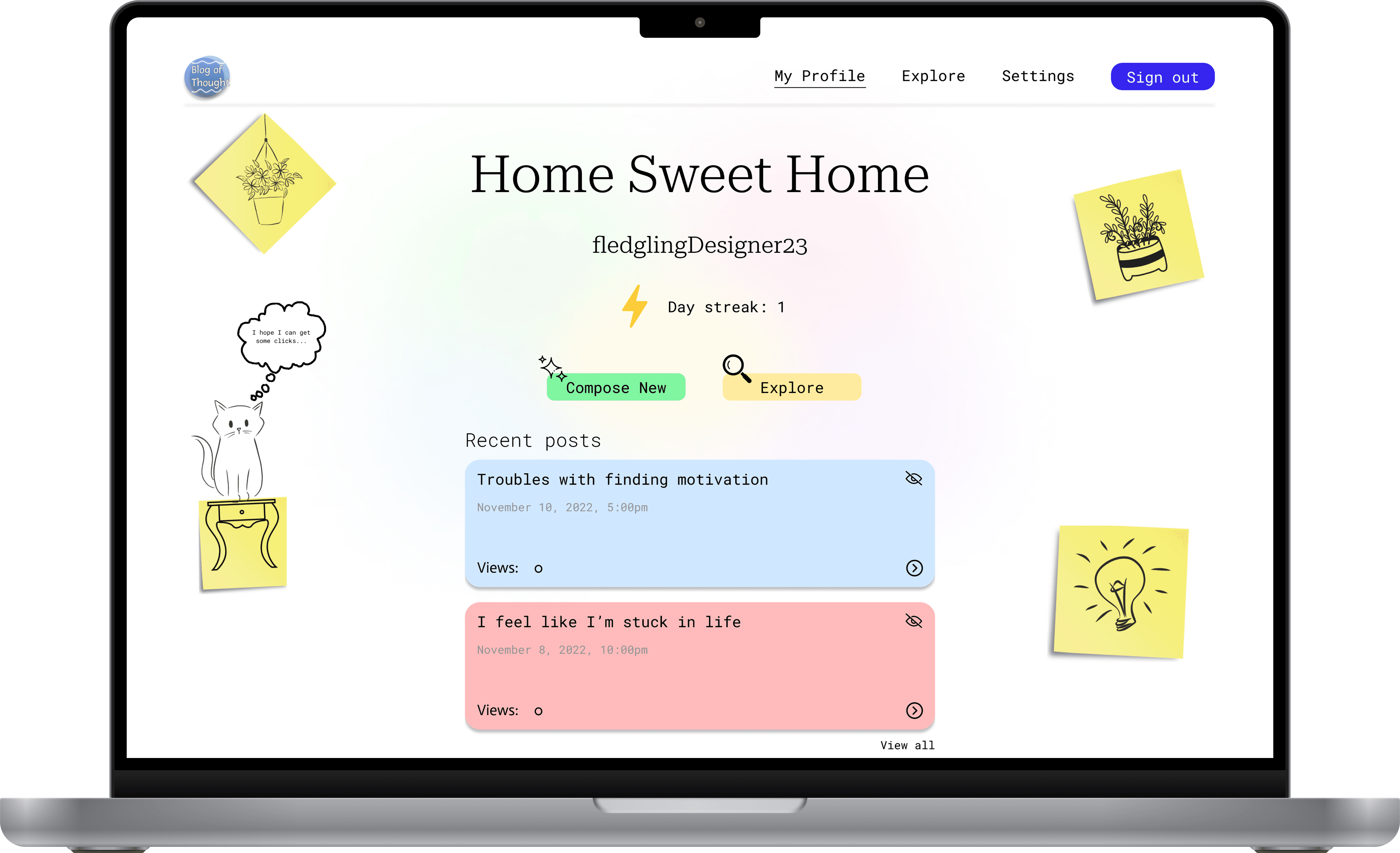
Inspired by sticky notes often used in brainstorming, we developed a design that captured the spontaneous nature of journaling. By incorporating paper-like textures and sticky note elements, this stationery-inspired aesthetic resonated well with stakeholders, becoming central to Blog of Thought’s unique and personalized identity.
Mood Rating Scale
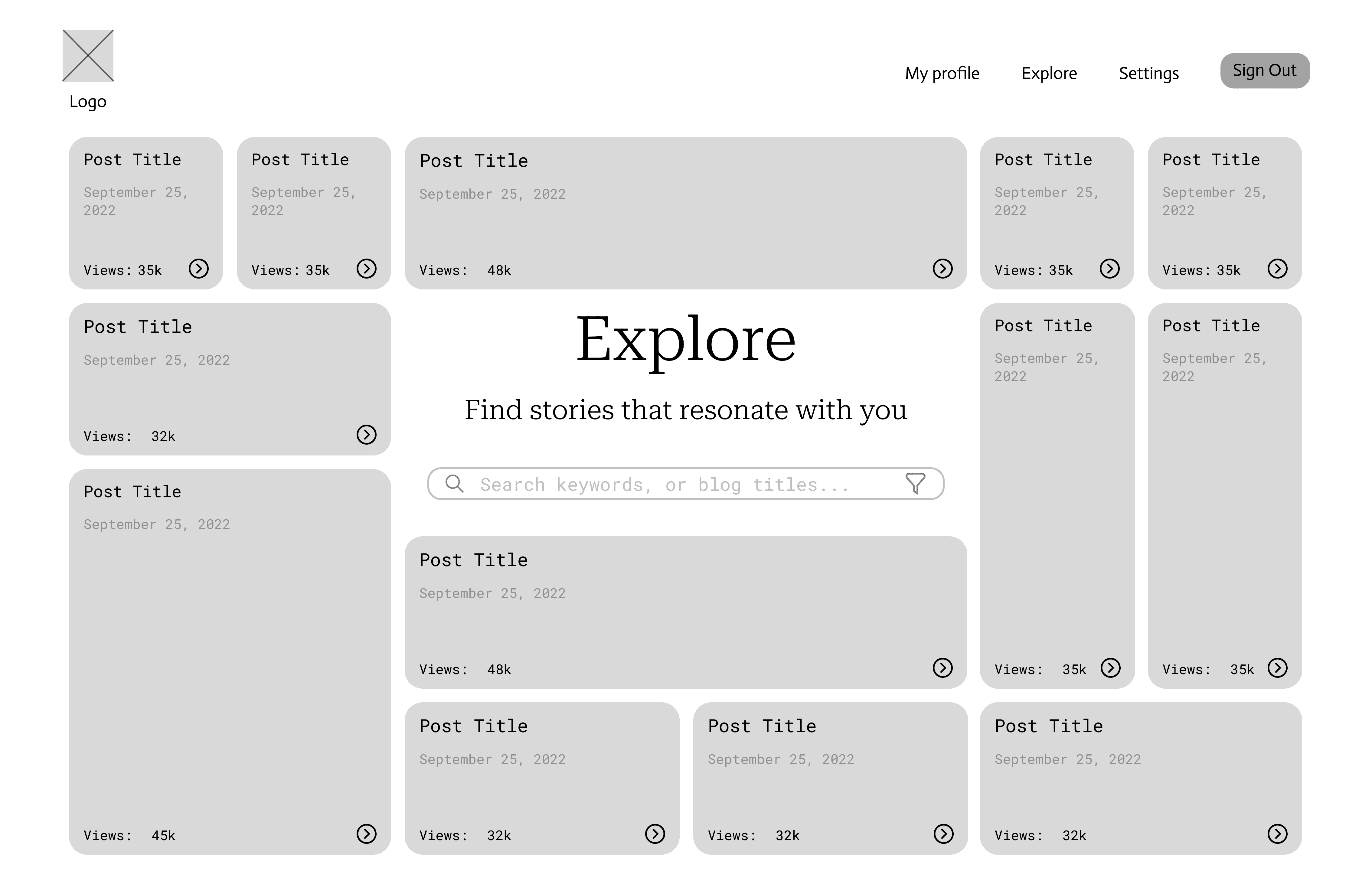
Explore Page: v1 - List View
Usability Testing
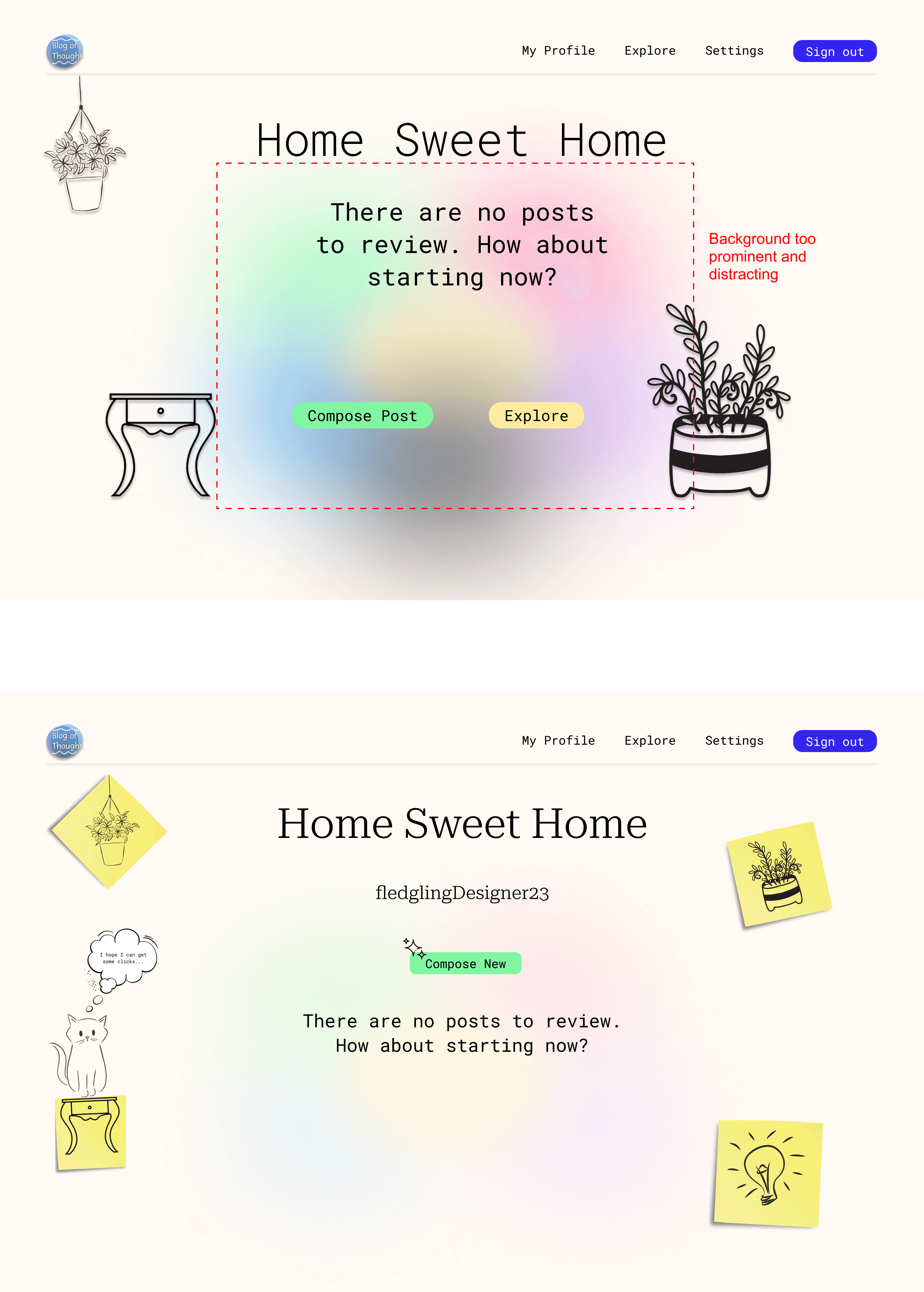
During usability testing for Blog of Thought, stakeholder feedback significantly influenced the final design. Initially, our vibrant colour palette, based on psychological colour theory, was found overwhelming, leading us to tone down the colours for a more subtle background that enhanced user experience.
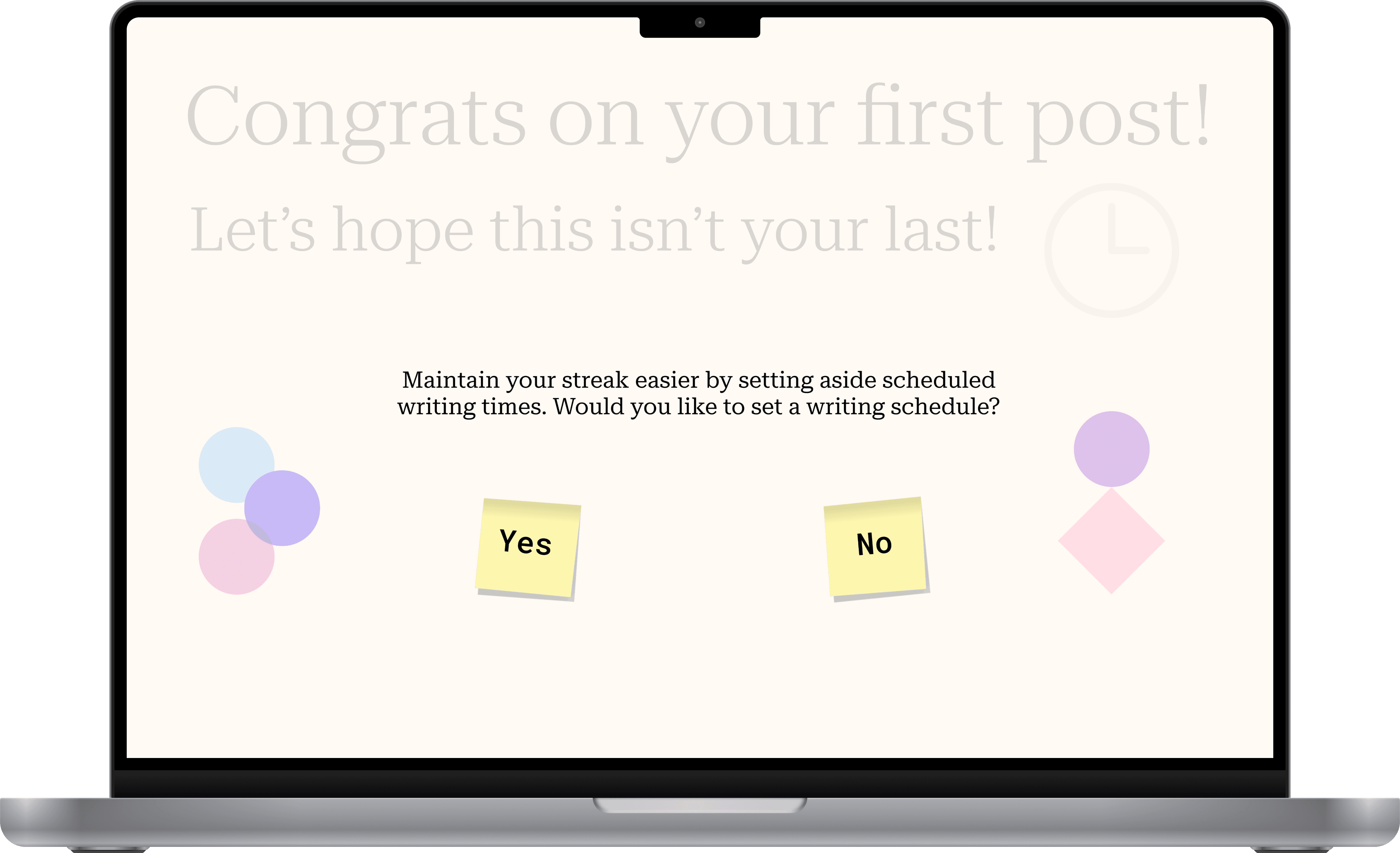
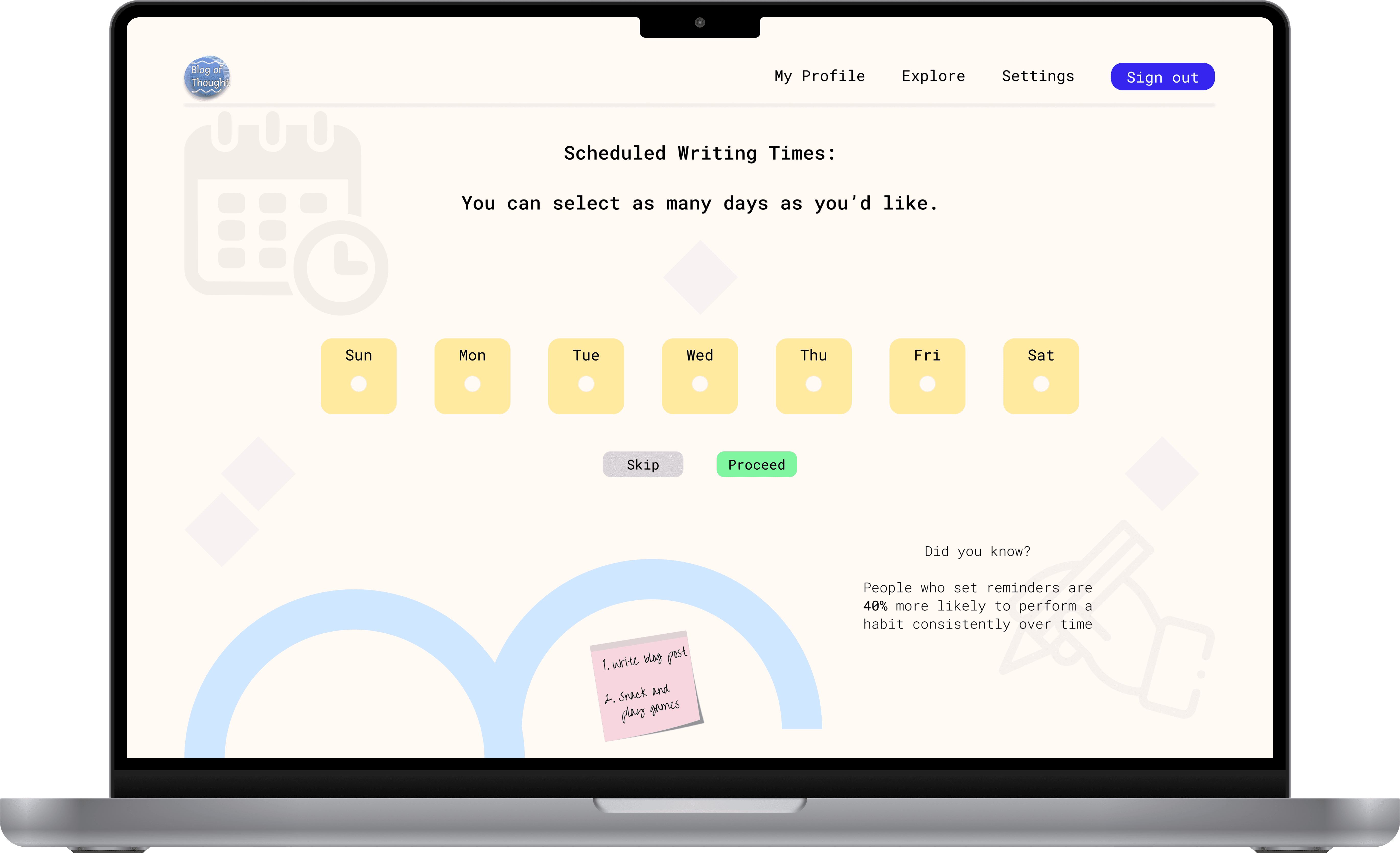
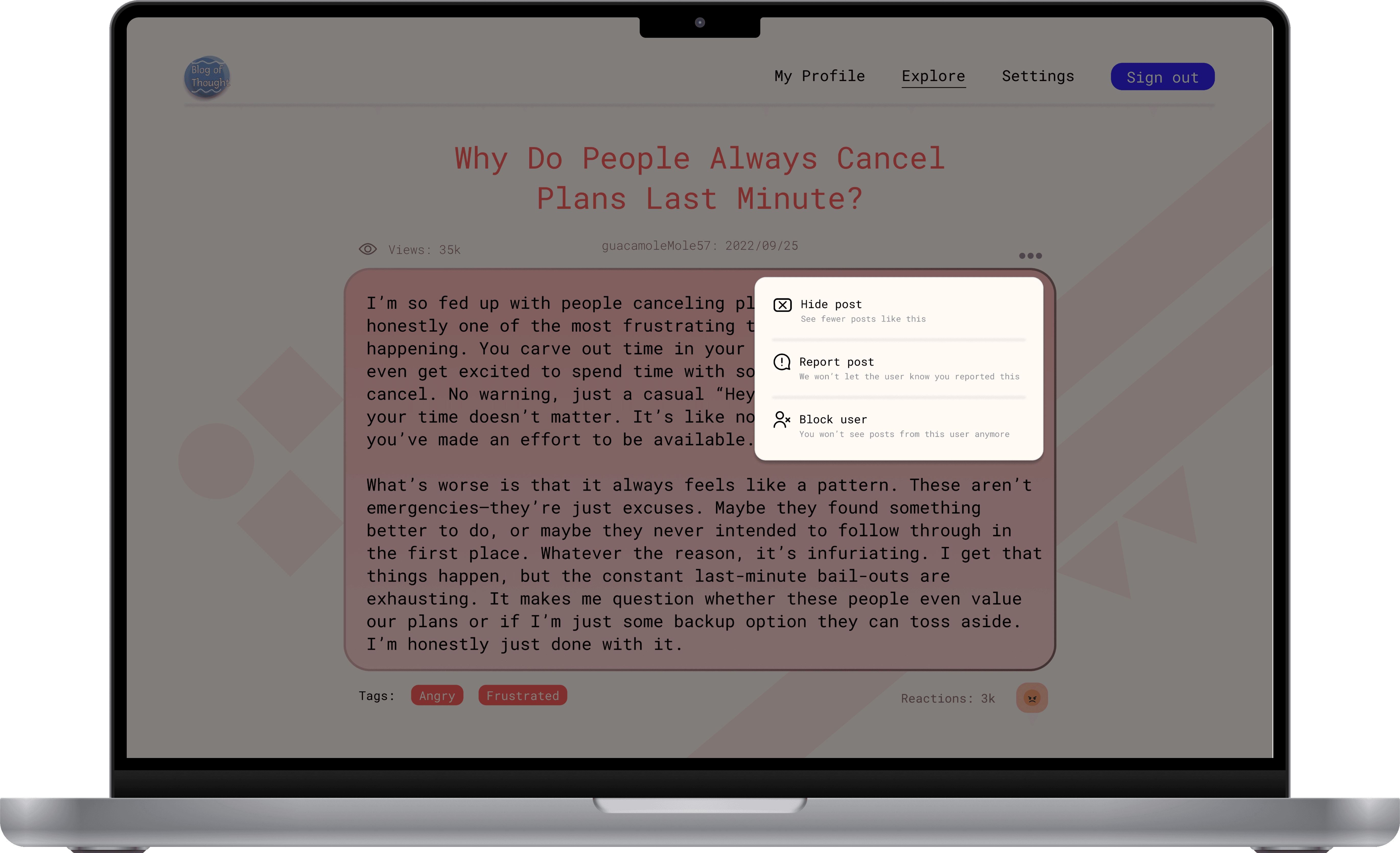
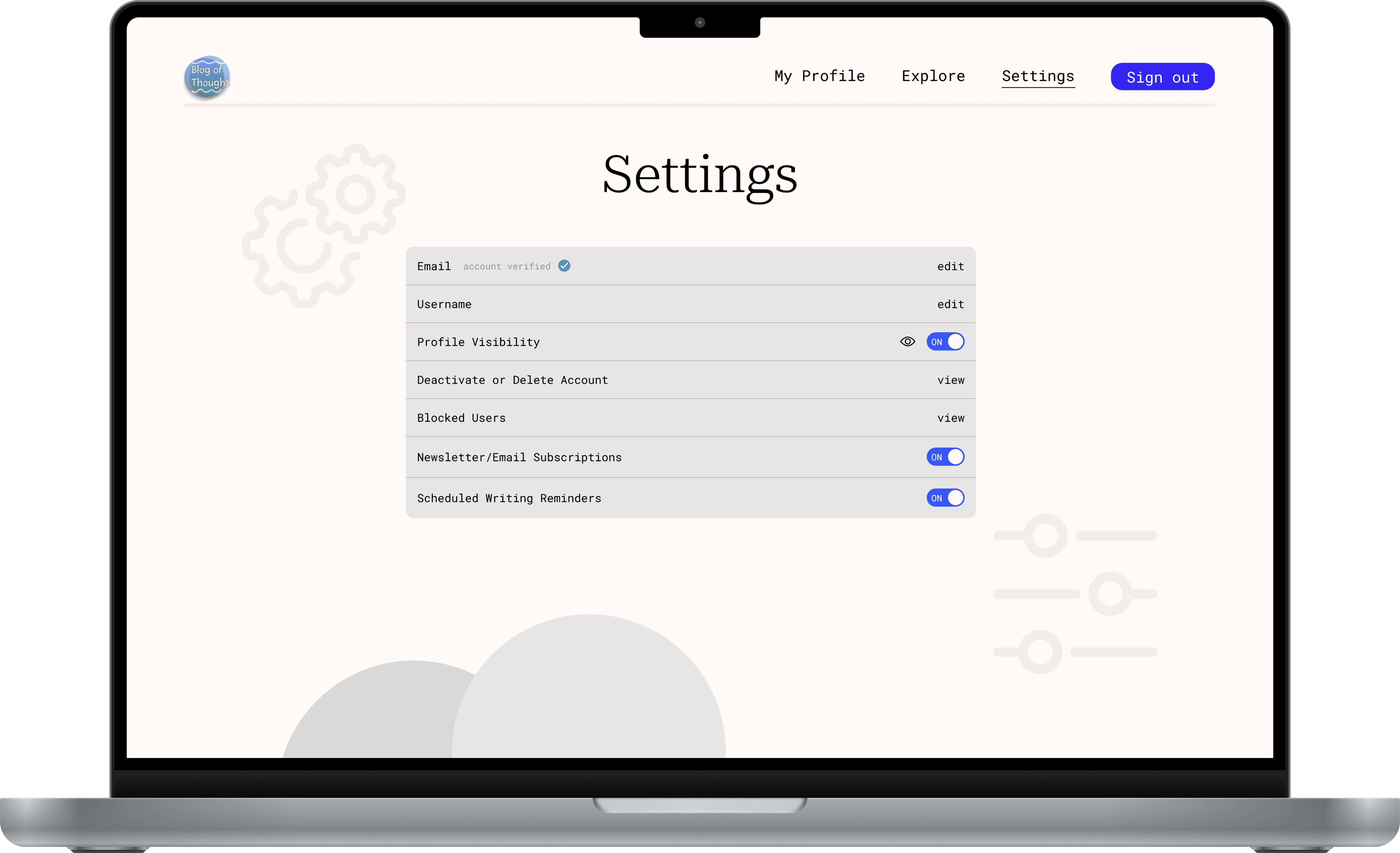
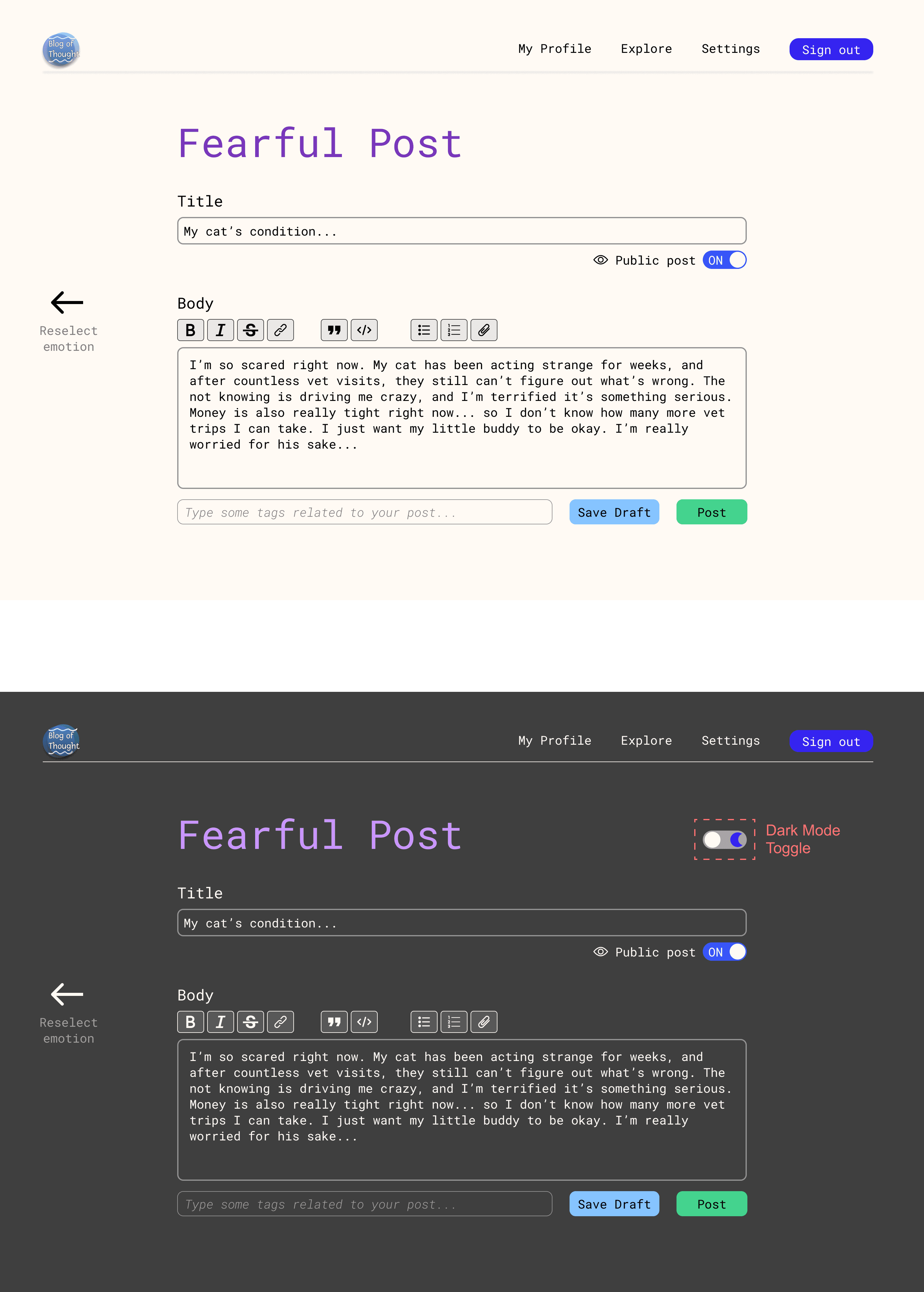
One of the key changes we implemented was the introduction of dark mode for reading and writing posts. This feature expanded the platform’s accessibility, creating a more comfortable and versatile experience that catered to varying user needs.
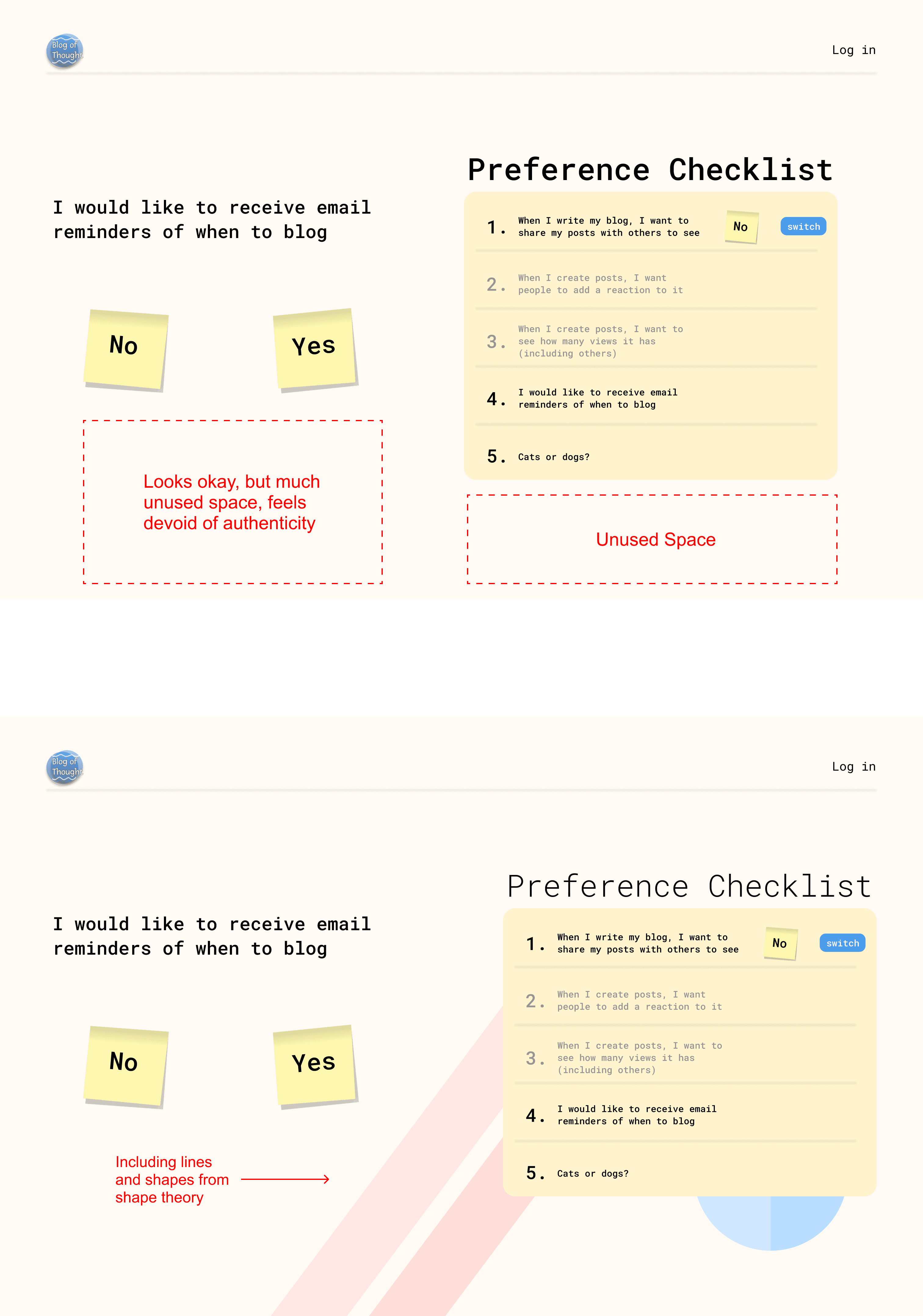
Stakeholders also felt the minimalist design lacked personality, prompting us to incorporate subtle shape elements for added visual interest and warmth. Additionally, we introduced a virtual pet companion feature, which made the platform feel more dynamic and personalized, enhancing user engagement.
Toned Down Colour Gradients, Added Pets! (Before & After)
Implementing Dark Mode (Before & After)
Lacking Personal Touch, Honing in on Shape Theory (Before & After)
Visual Design & Style Guide
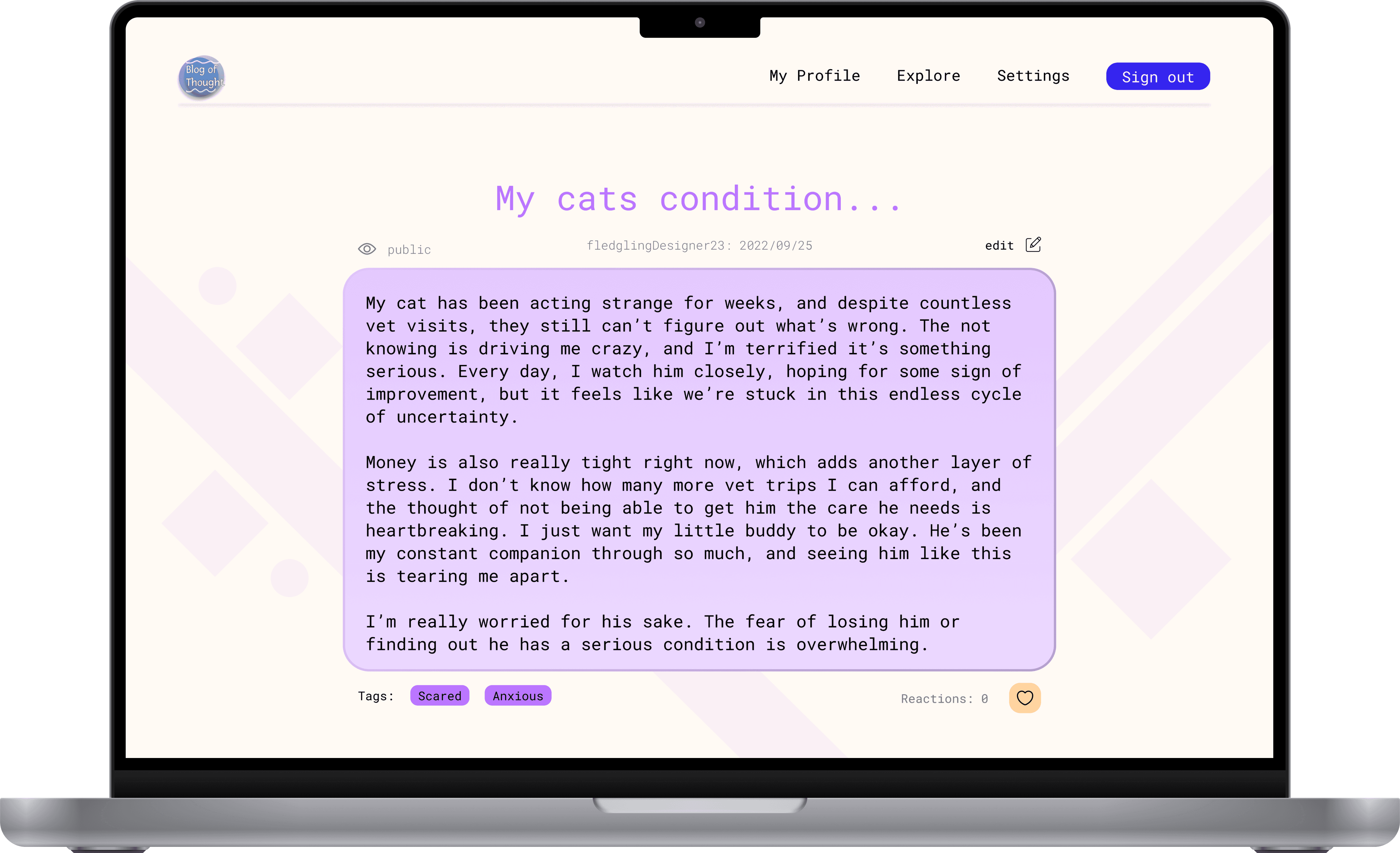
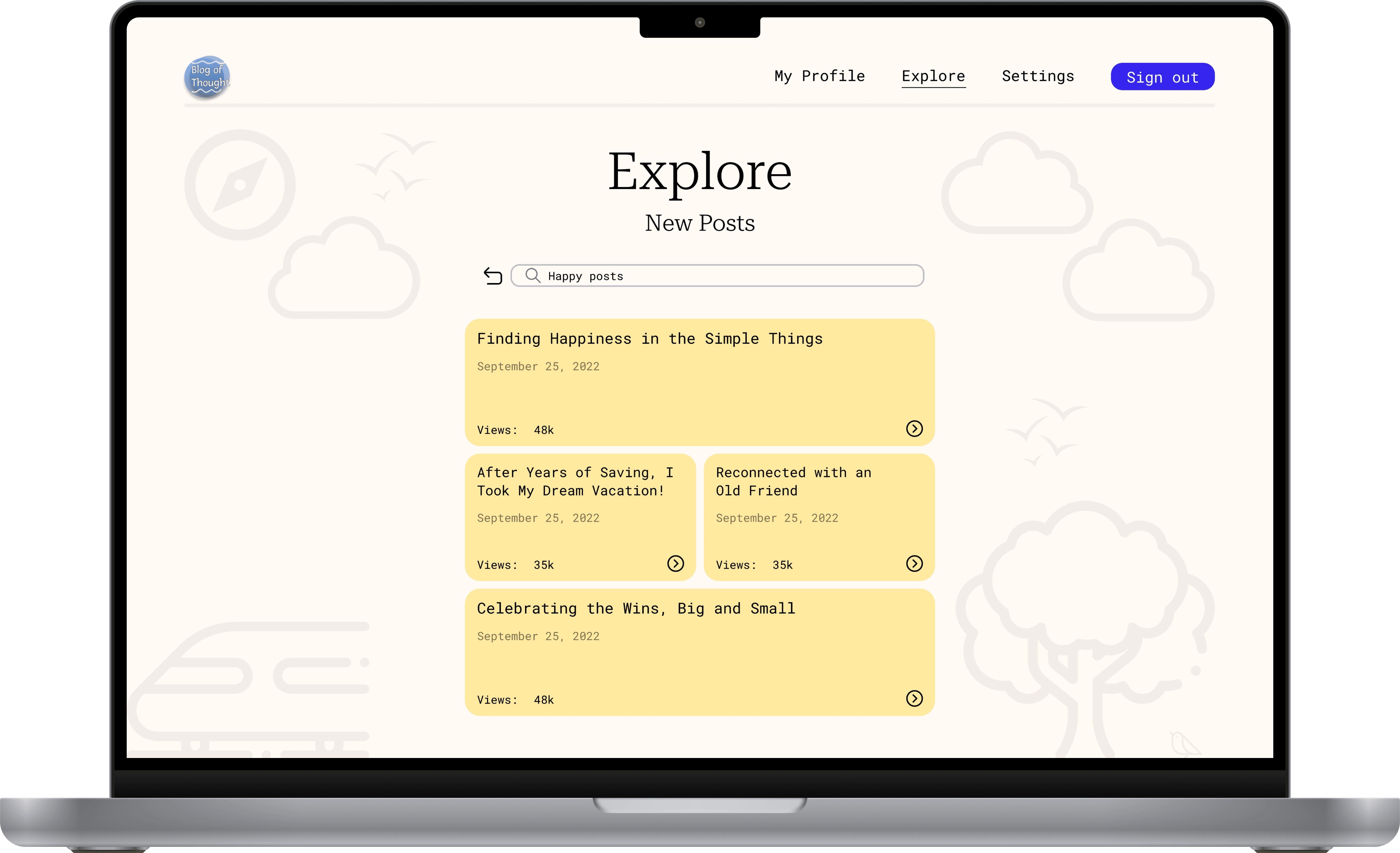
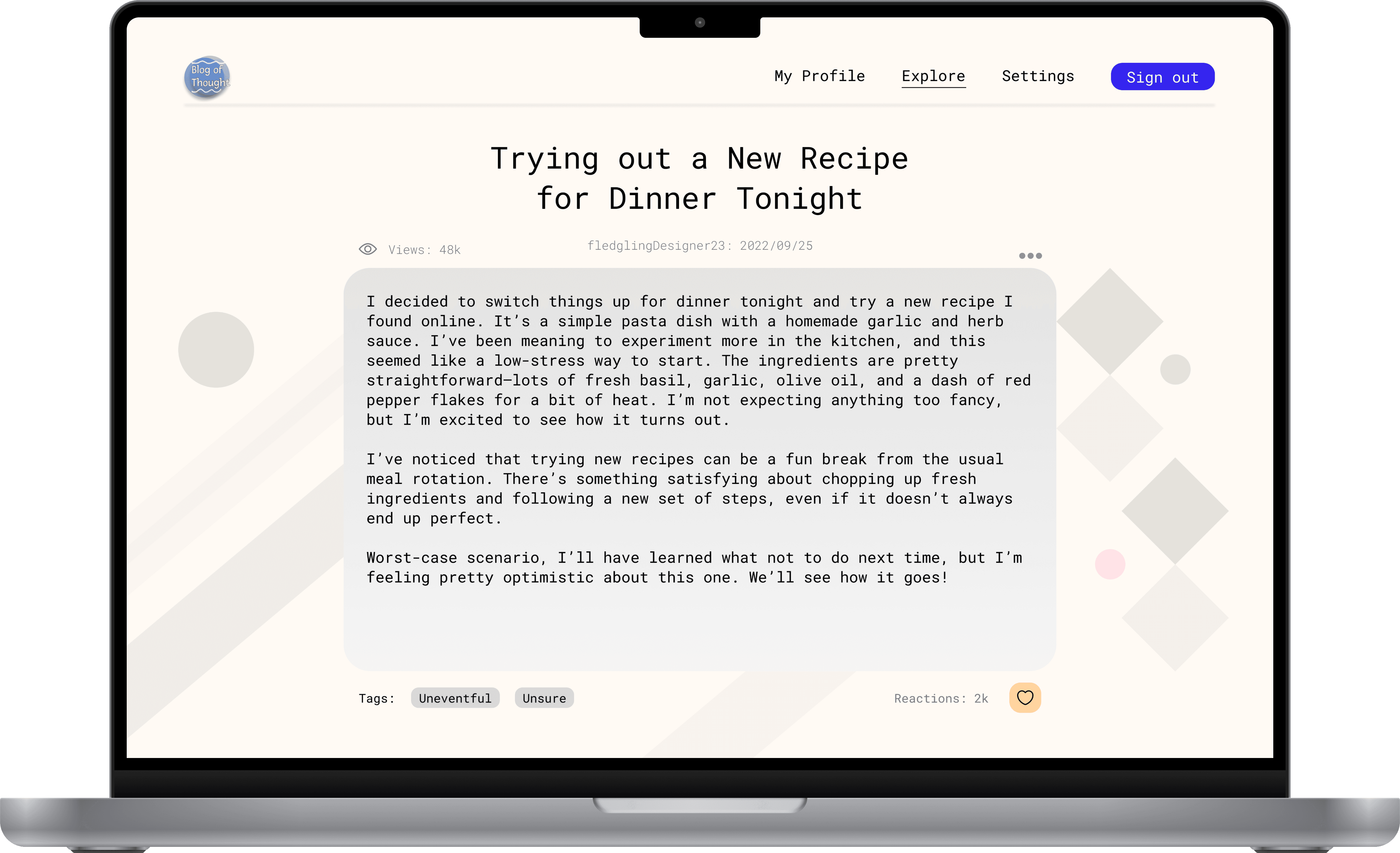
The UI of Blog-of-Thought was crafted to create a calm, reflective, and personal experience, featuring a pastel colour palette that ties closely together to the five base emotions—happiness, sadness, anger, fear, and disgust. These soft, muted colours were intentionally chosen to maintain a welcoming tone without overwhelming the content, ensuring clarity when expressing different emotions and upon reading blog posts associated to different emotions.
For typography, we selected a simple, minimal font that mimicked traditional writing, enhancing the stationery-like aesthetic. This choice ensured legibility during longer journaling sessions, with a clear hierarchy for headers and body text to facilitate navigation.
We balanced negative space with visually appealing elements to avoid clutter while giving each journaling post enough room to breathe. This thoughtful spacing fostered a soothing environment conducive to reflection, helping to create a distinguishable appearance with Blog of Thought.