Case Study
PAWS Mobile
Transforming student struggle into success by reinventing a web-based application into a user-centred, mobile experience.

Challenge
Students at the University of Saskatchewan face significant frustration with PAWS due to its lack of personalization, cluttered interface, and text-heavy design. The registration process is especially problematic, being cumbersome and anxiety-inducing due to its static nature and confusing layout. This disconnect makes it challenging for students to navigate and complete tasks efficiently, impacting their overall experience.
Results
The redesign led to significant improvements in user satisfaction and engagement. By streamlining the registration process and introducing personalized features, students reported a 55% reduction in the time spent on key tasks, alleviating stress and anxiety. The new design's intuitive interface, reduced cognitive load, and dynamic updates were praised for making PAWS more user-friendly and efficient. Overall, the project successfully addressed the core pain points, resulting in a more cohesive and tailored experience that better met the needs of the University of Saskatchewan's students.

Design Process
Research & Analysis
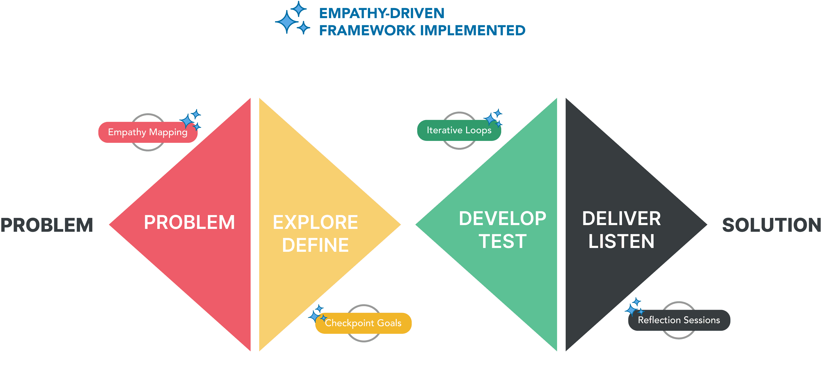
Upon conducting my research, I came across a unique study which looked at the effects of empathy-driven design in practice. The results concluded that without a framework to guide the empathy process, much of the purpose is lost and success rates plummet. Thus, I made it a priority to go beyond the standard Double Diamond Process, and incorporate elements of empathy-driven design into my already existing design methodology. I then conducted in-depth user interviews with six U of S students while also analyzing in-app analytics to better understand their pain points and empathize with user needs. With that information, I continued my research into other competitor apps and industry trends to gather insights into what works well for students, and what doesn't.
Incorporating Empathy into the Double Diamond
Identifying the Problem
Upon preliminary research, it was evident that PAWS is a one-size-fits-all solution, catering to both students and administrative staff, ultimately lacking a user-centred design.
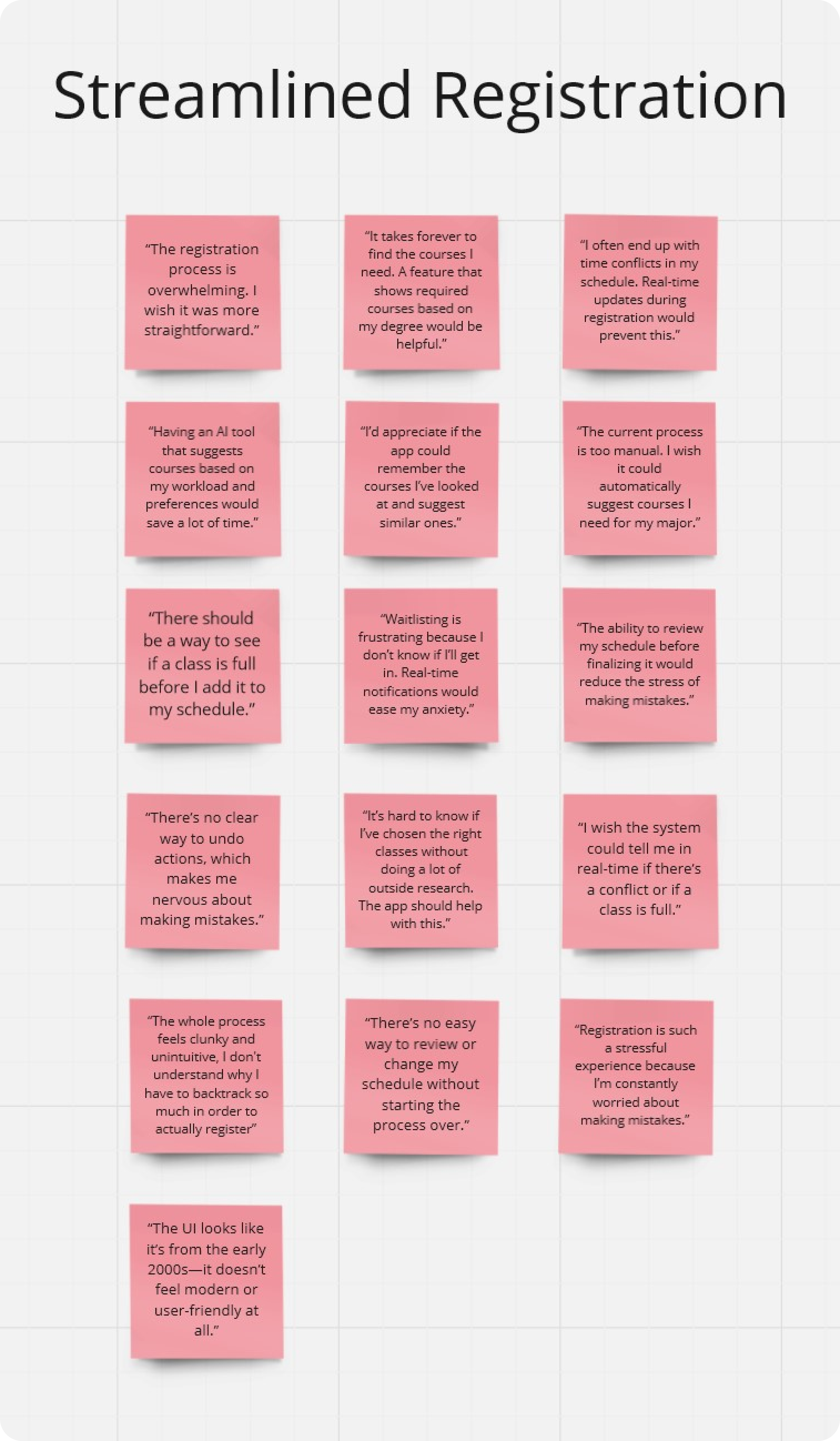
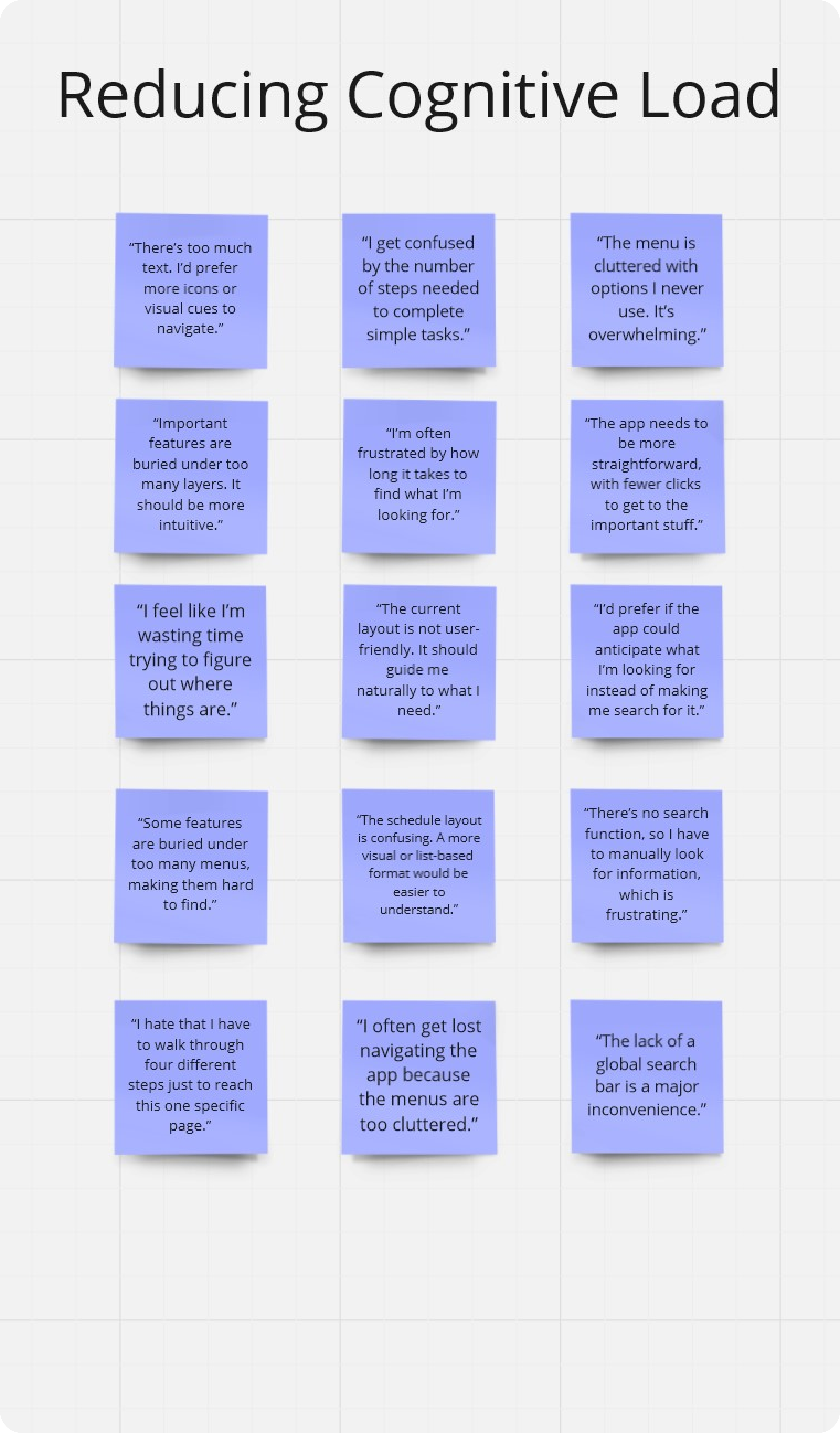
After aggregating the data, and completing affinity mapping, I identified three main themes:
Lack of personalization
Registration anxieties
High degree of cognitive load
User Affinity Map
Exploring Concepts & Designs
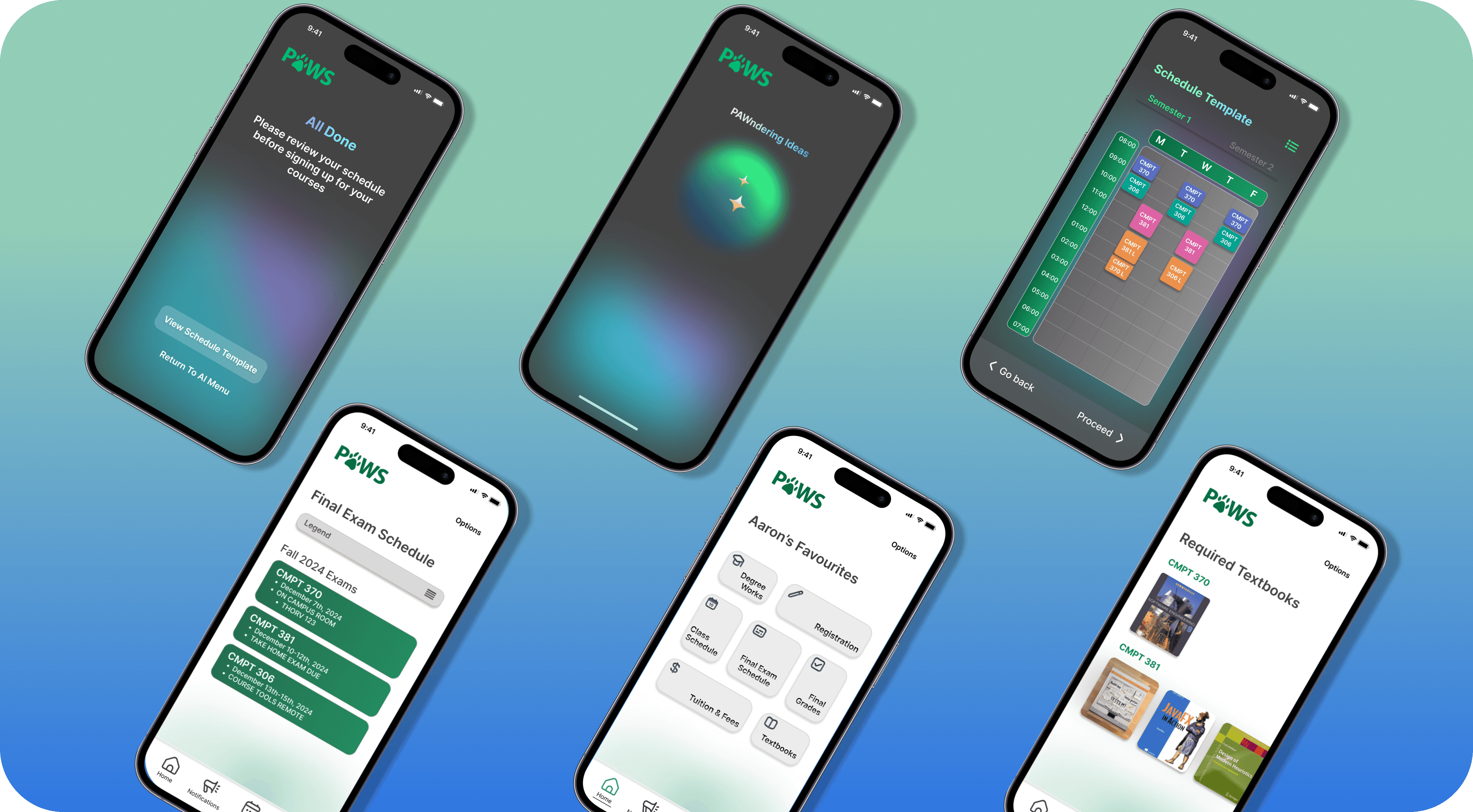
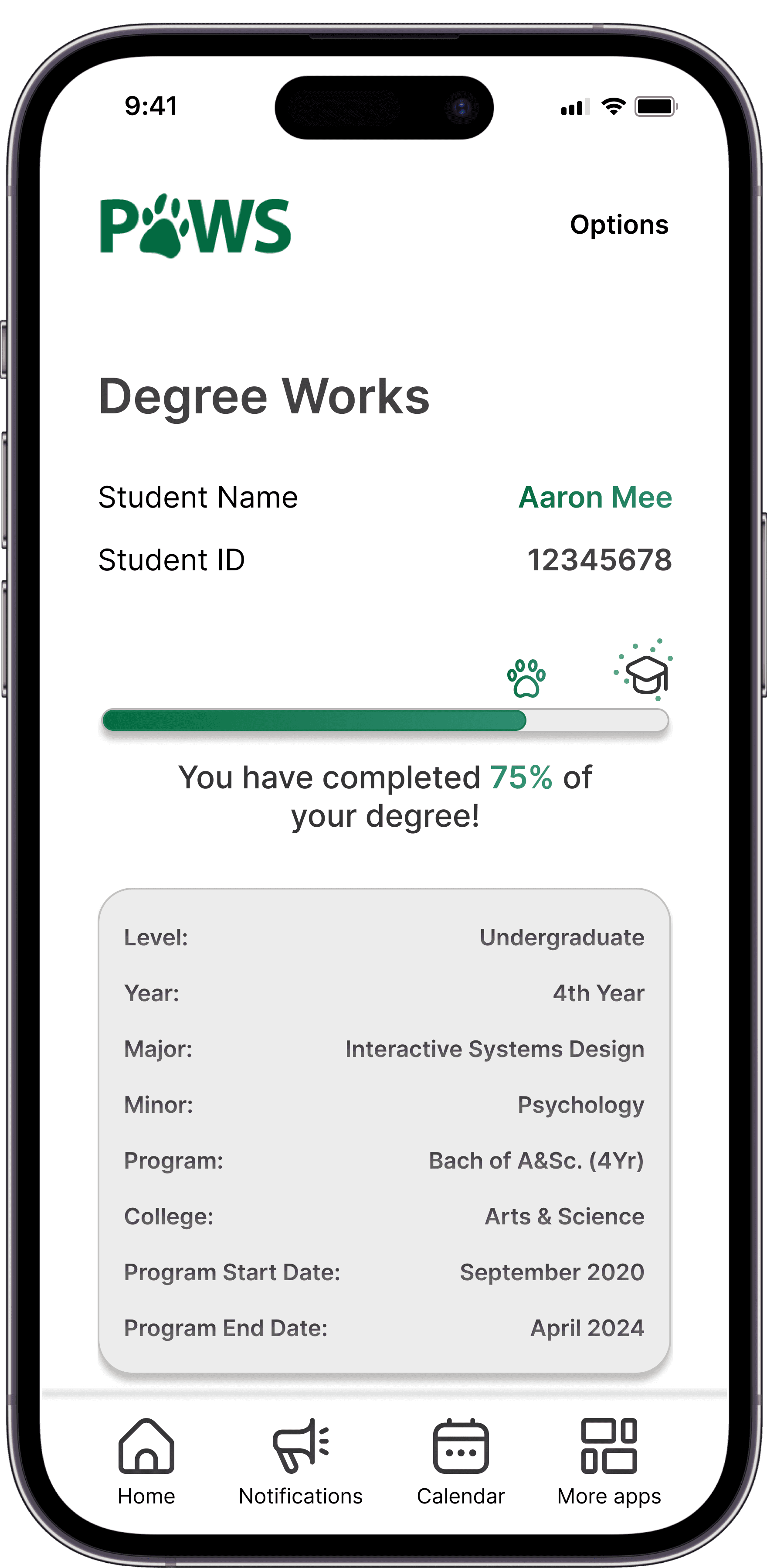
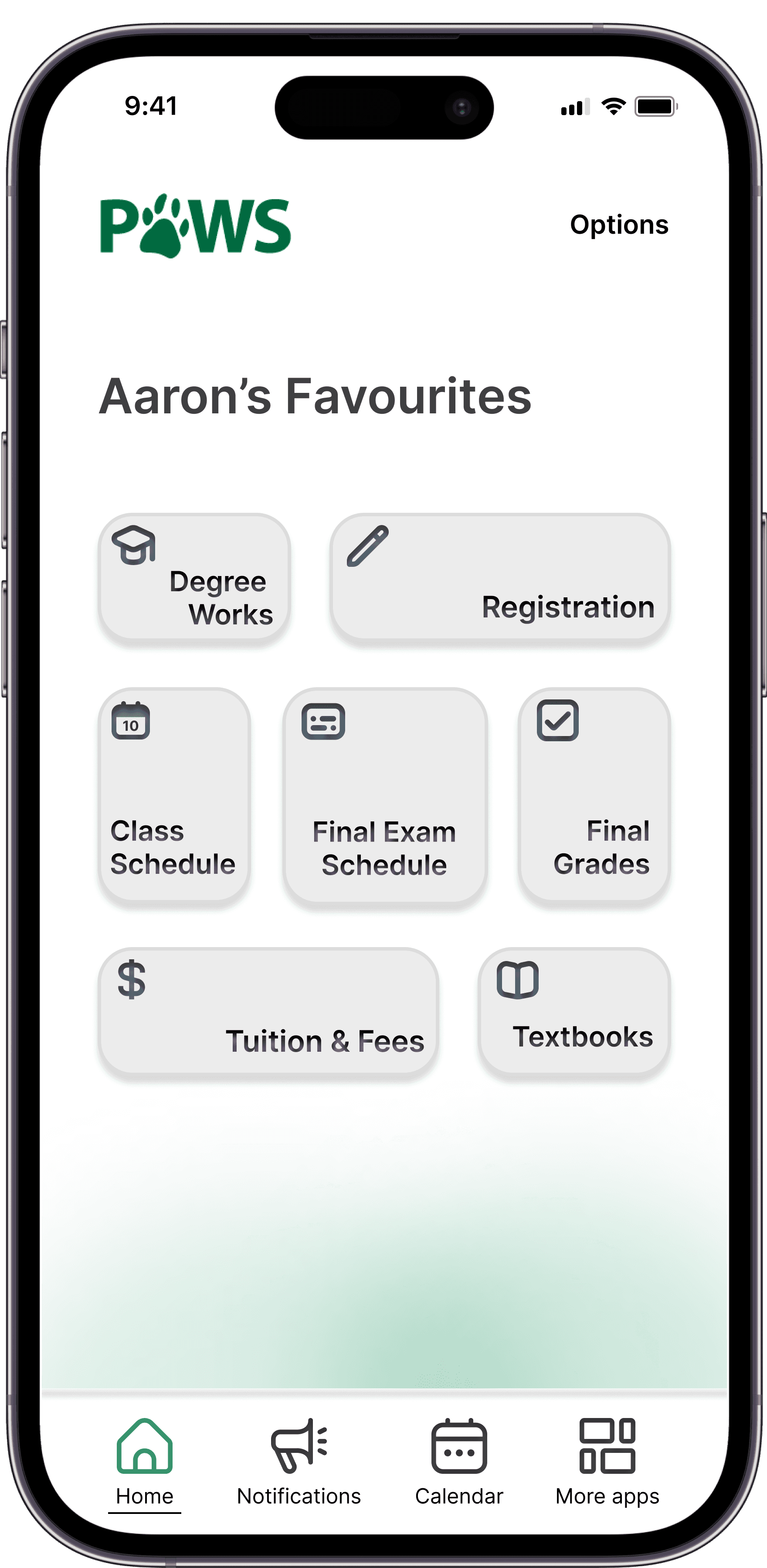
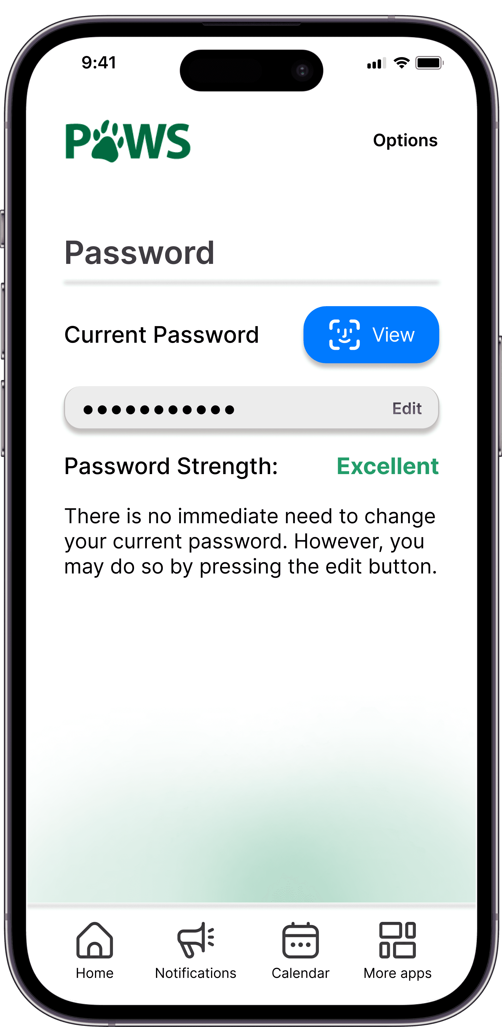
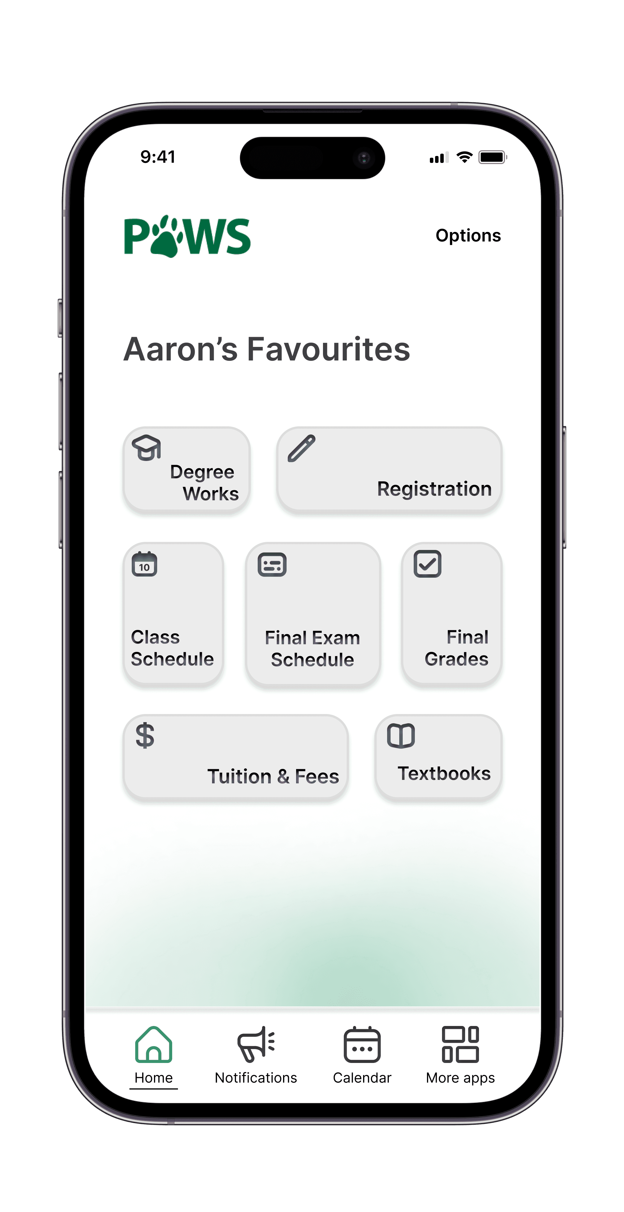
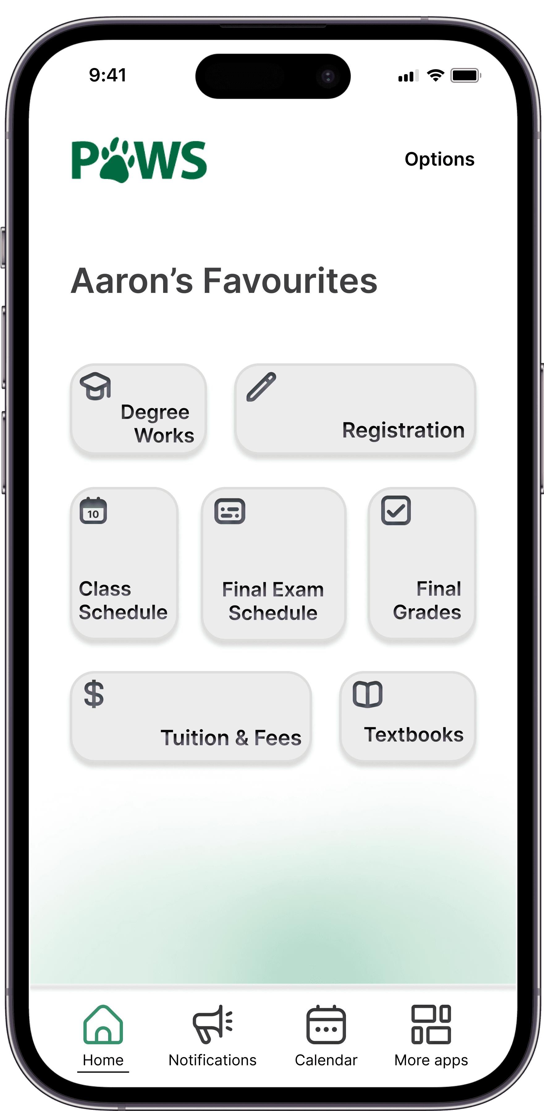
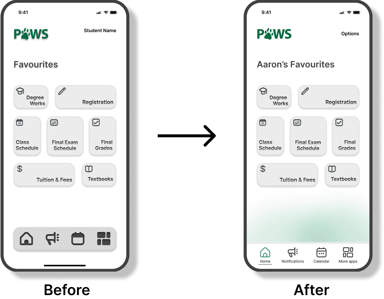
Based on my user research, I focused on creating an experience that was centered around students and their specific academic needs. The redesign was personalized to each student, beginning with a landing page that displays their favourite channels for quick and easy access.
The UI was modernized to reduce reading time by honing in on iconography, effectively communicating key information with minimal text.
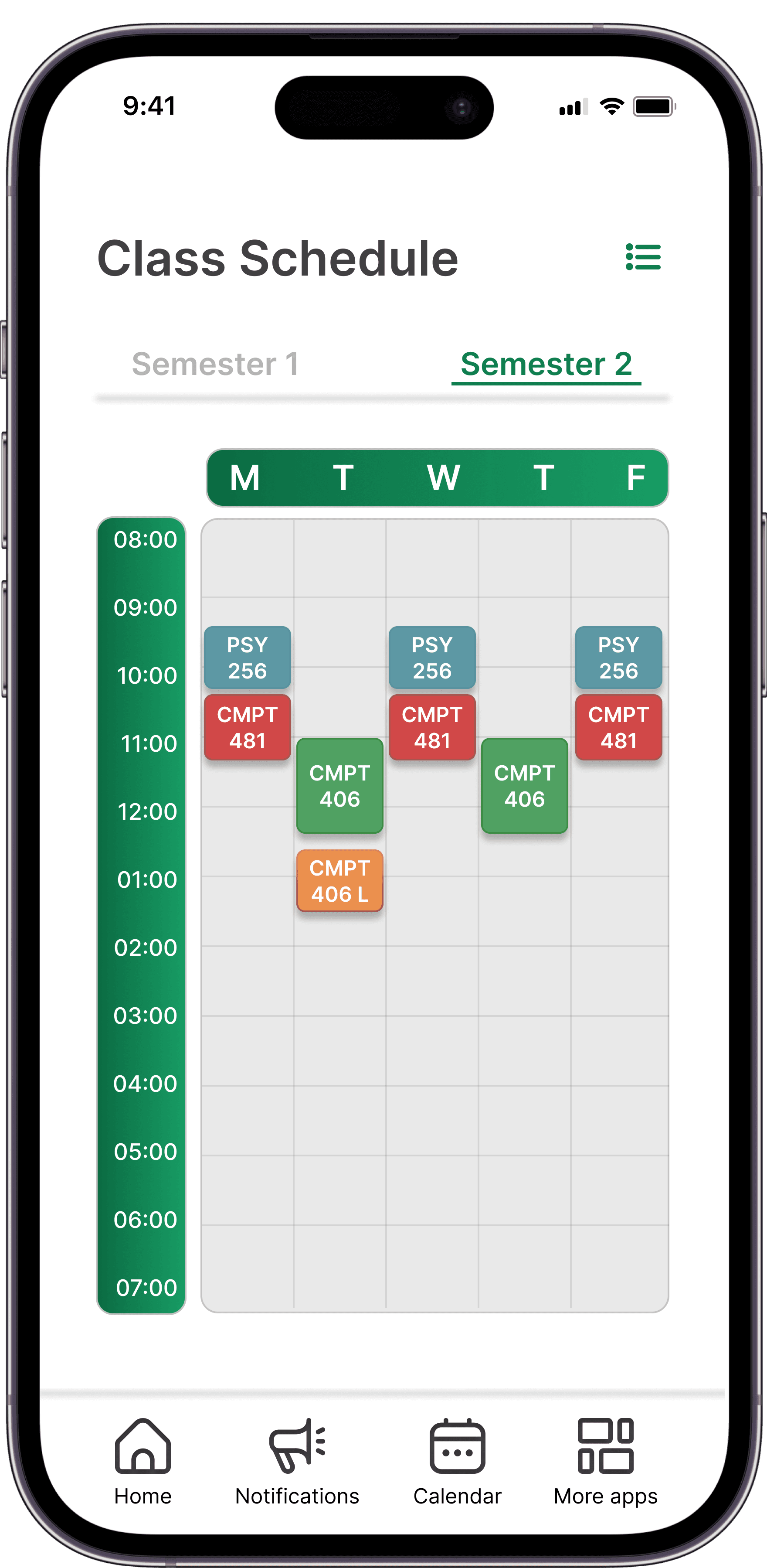
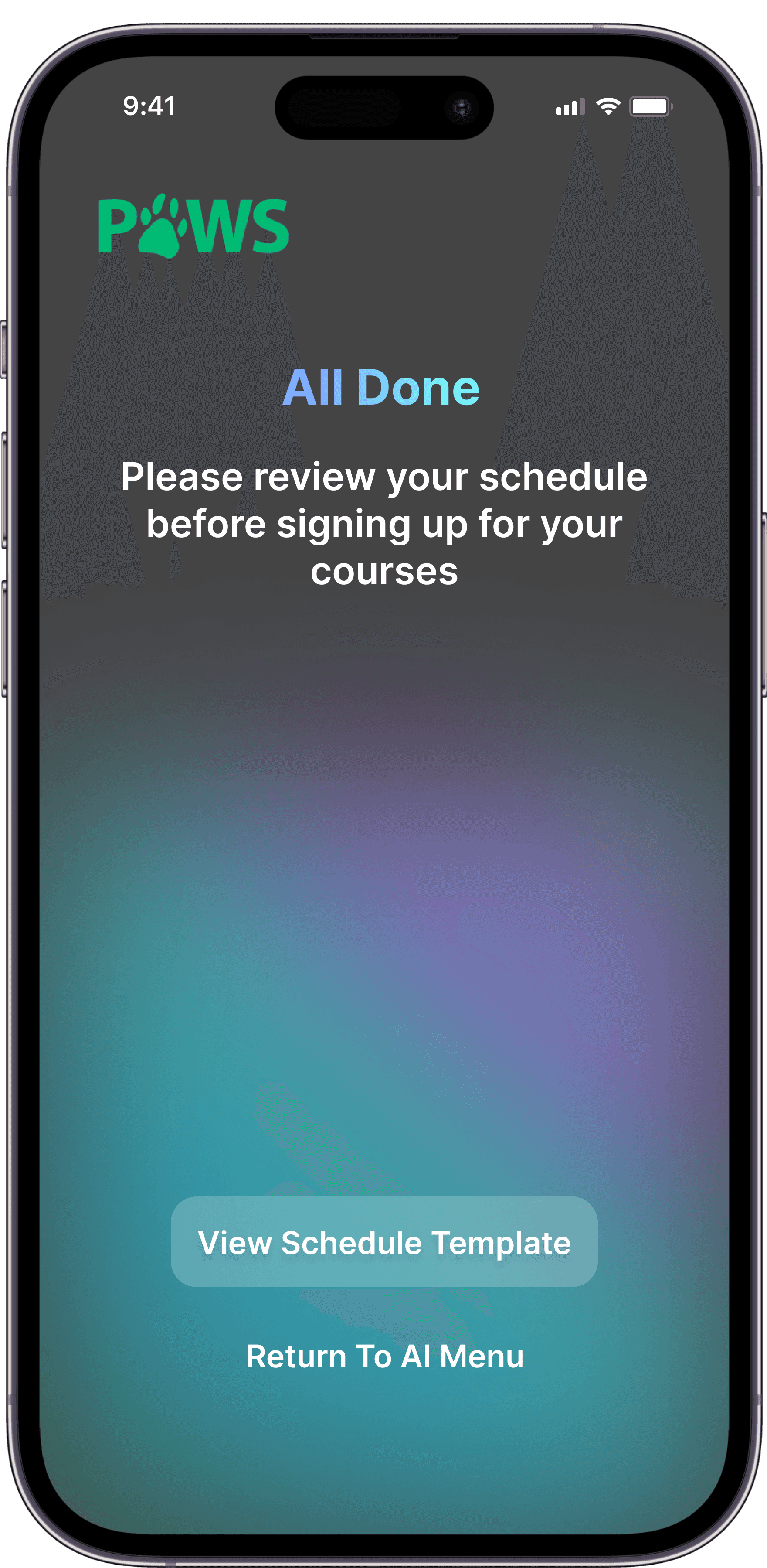
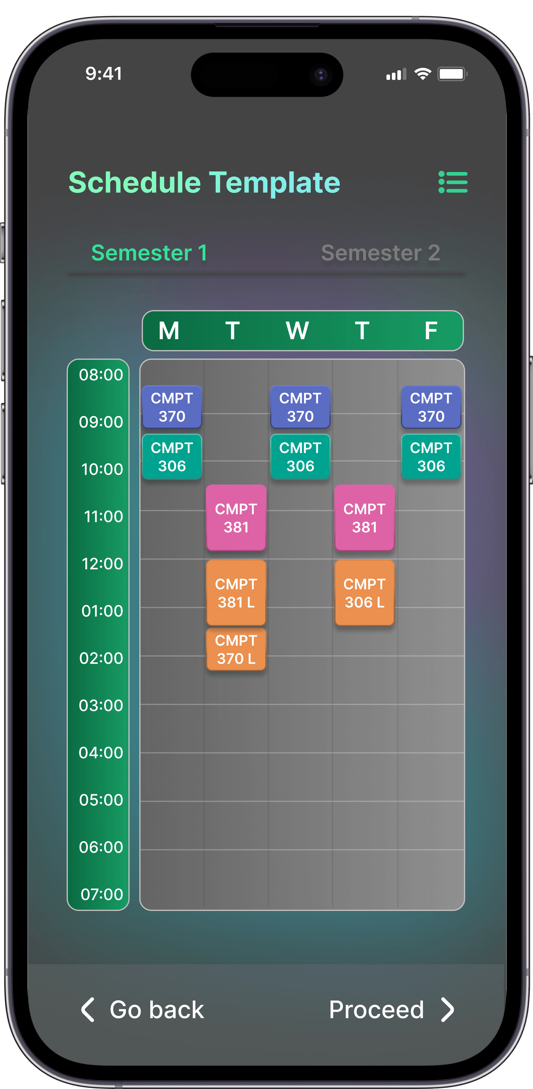
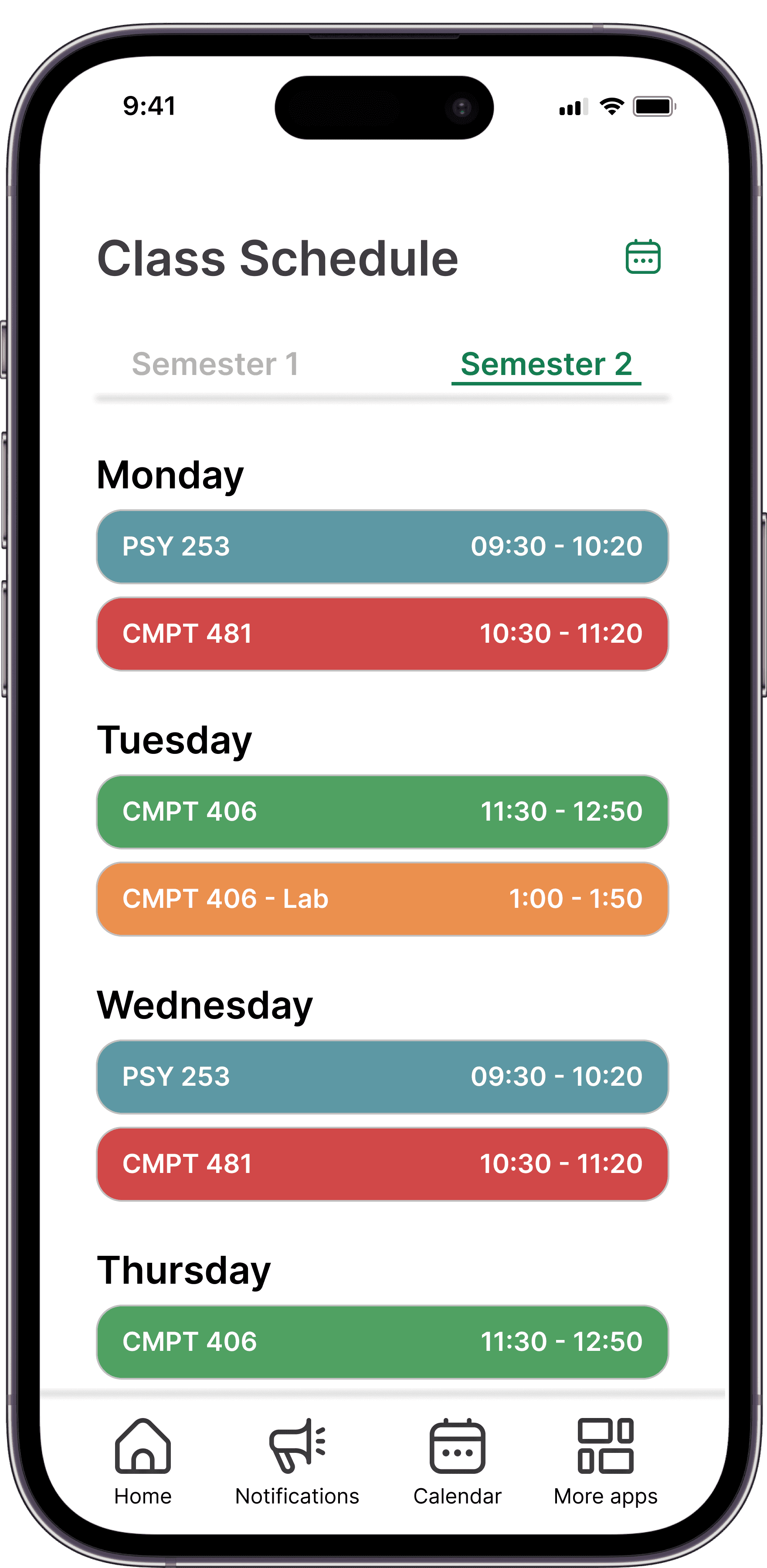
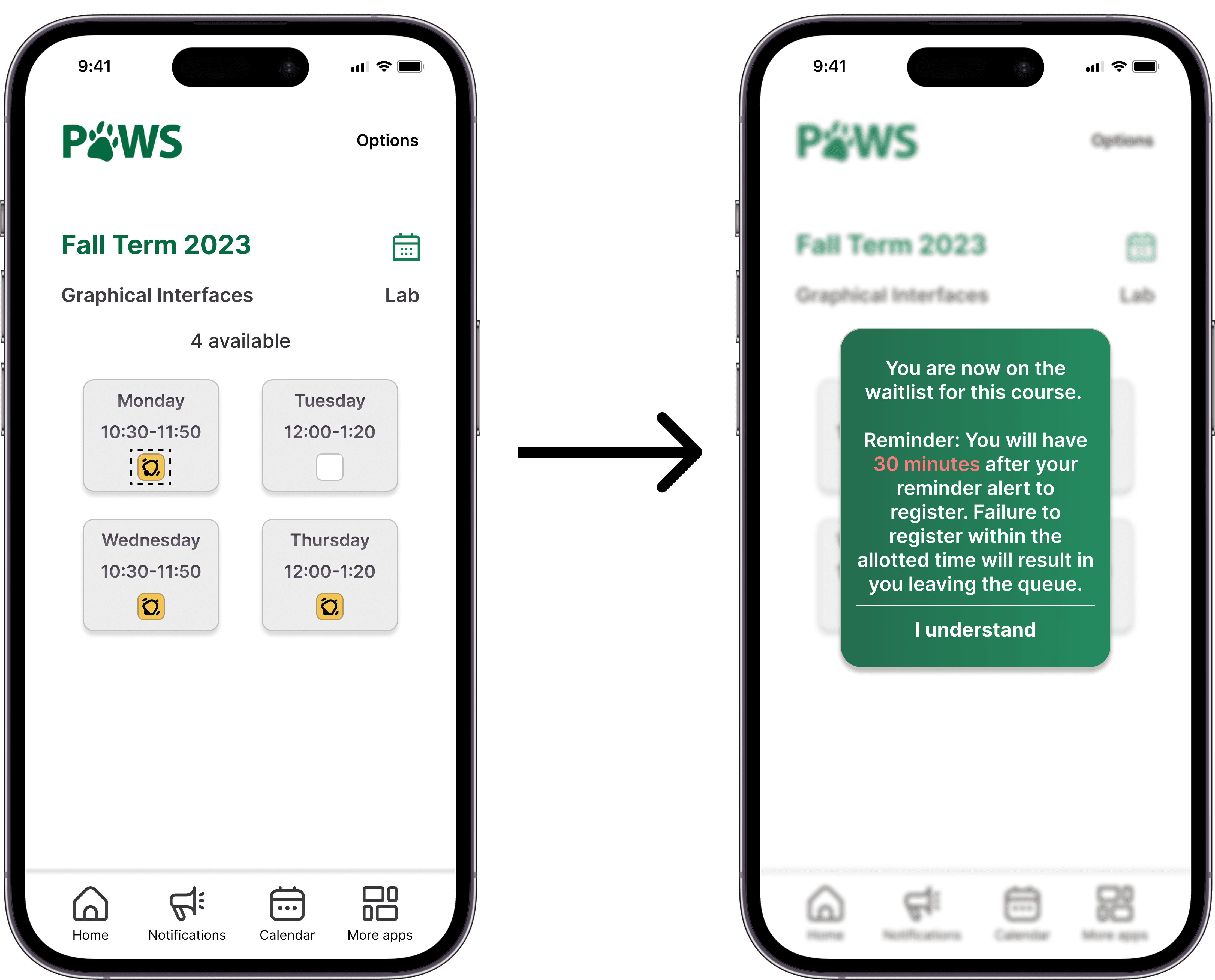
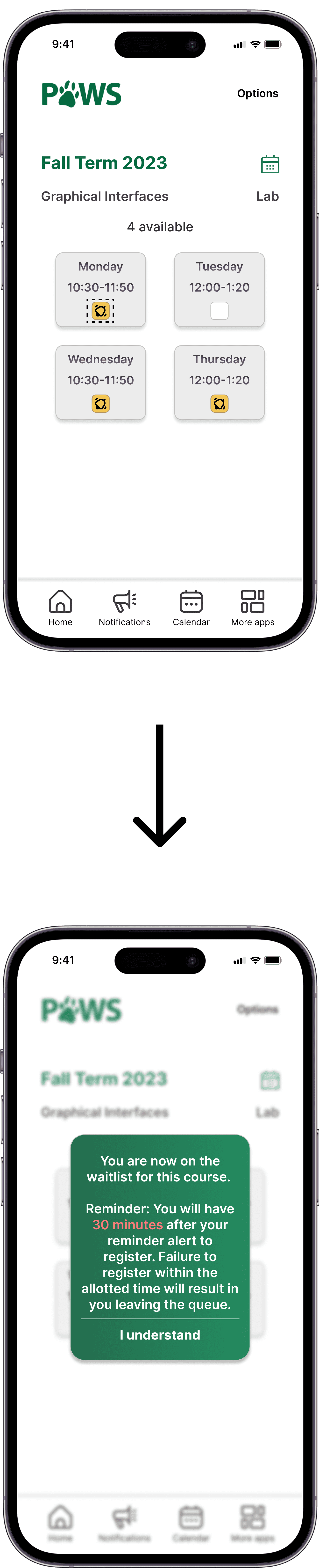
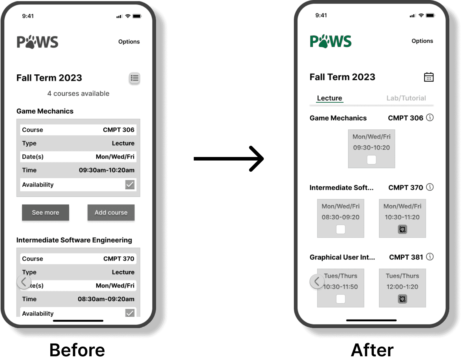
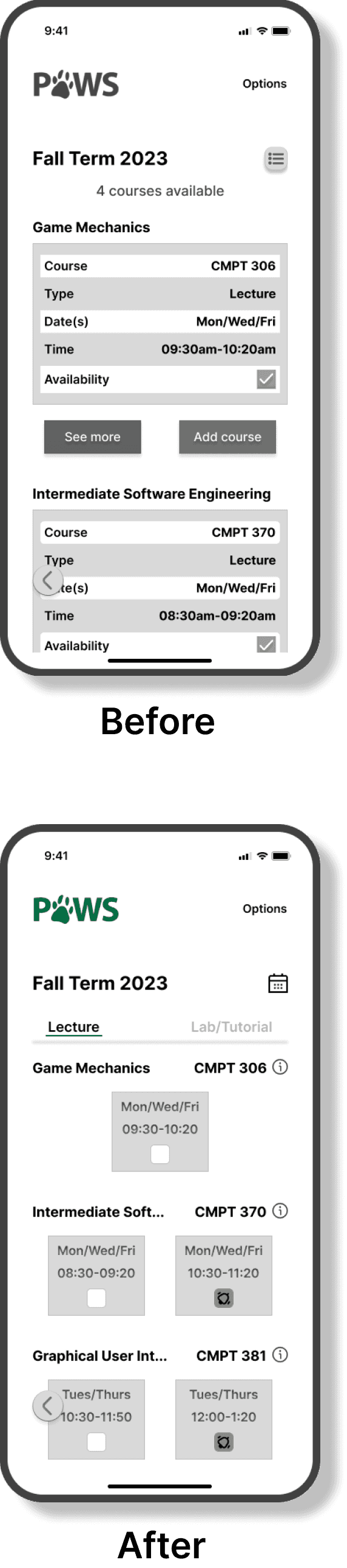
Additionally, the registration process was streamlined by redesigning the interface contained in a dynamic system. This ensured that errors, time conflicts, or required labs were promptly flagged in real time, significantly improving the overall user experience.
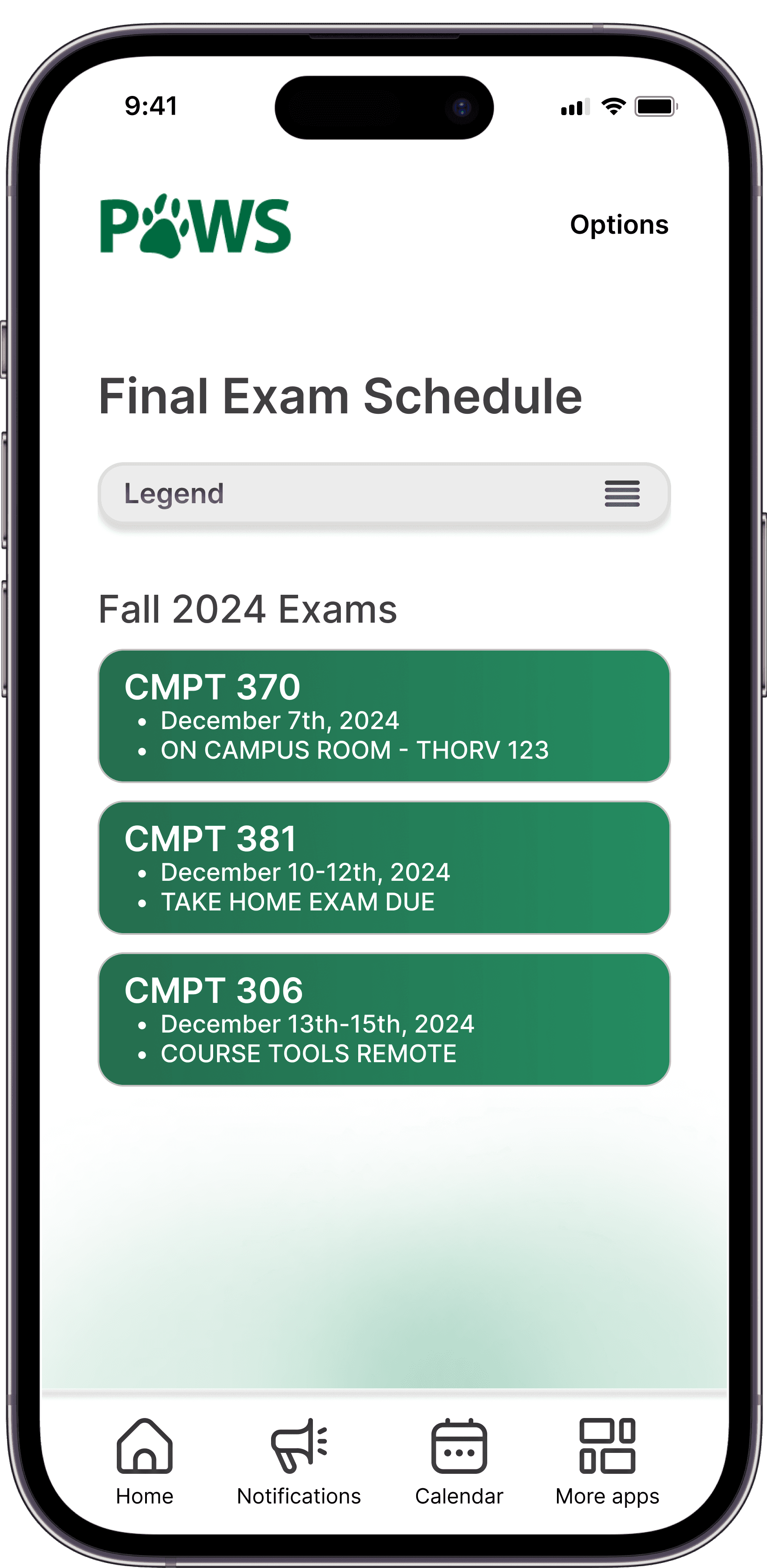
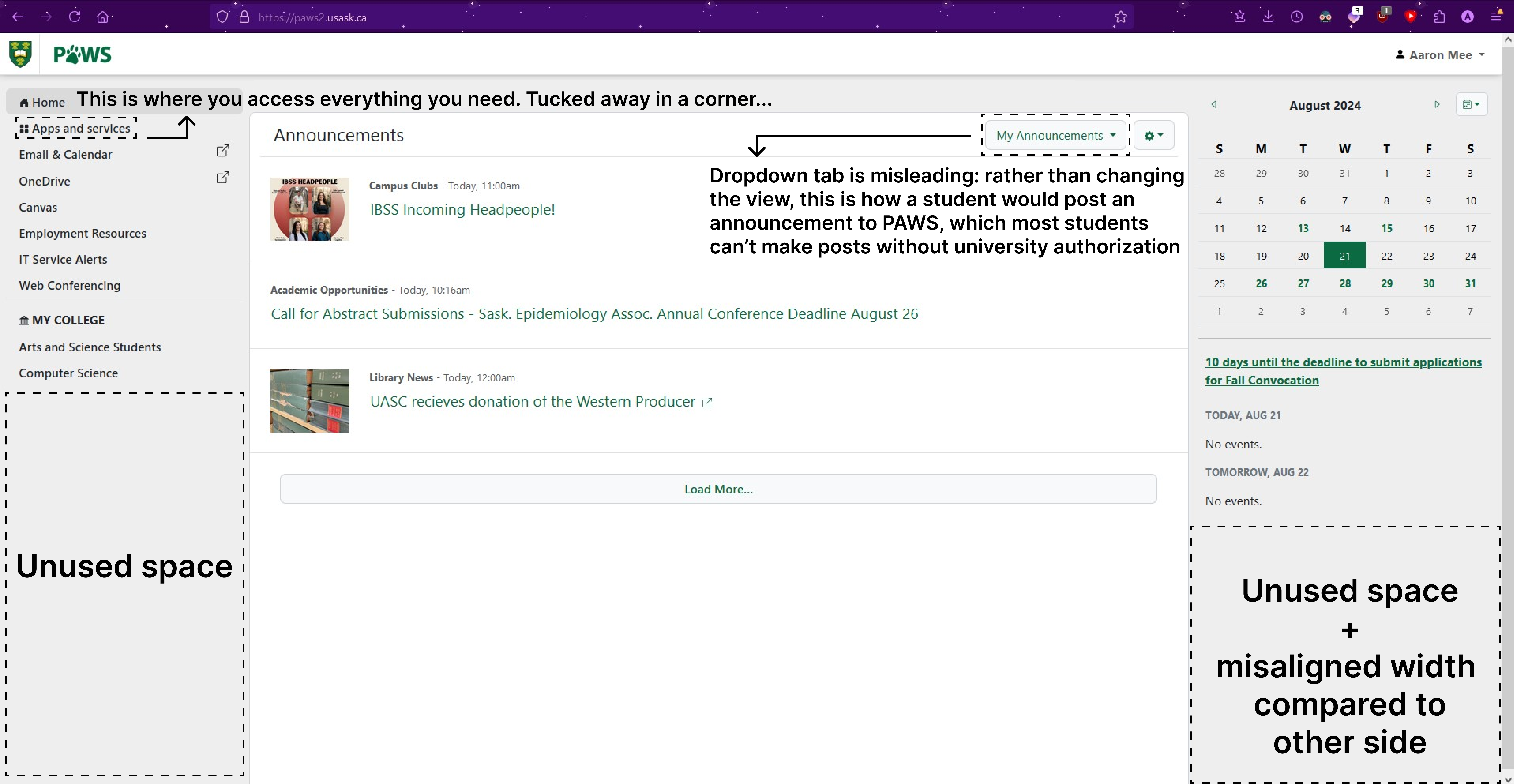
PAWS Home Page
PAWS Registration
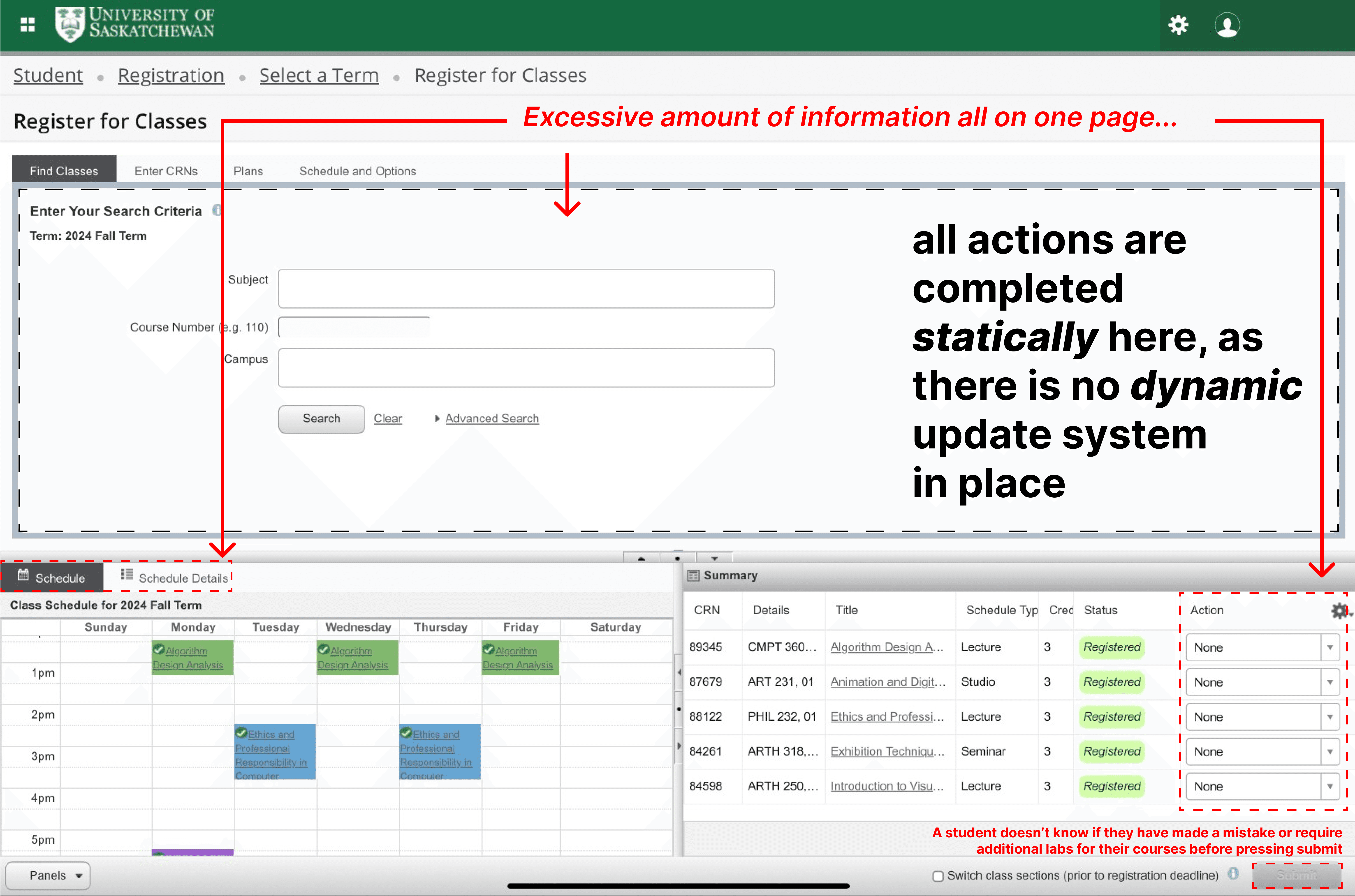
Dynamic Course Registry System
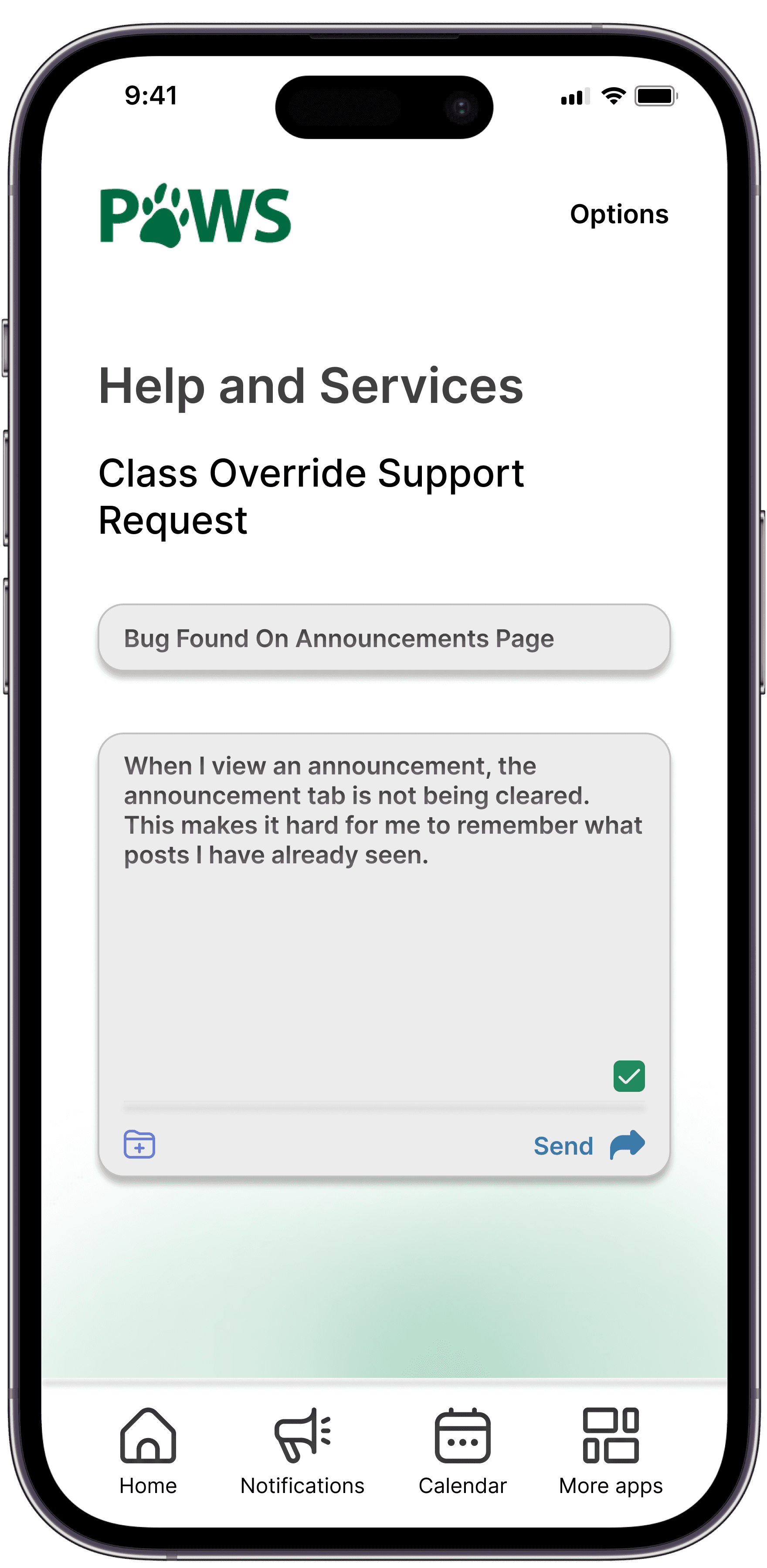
Usability Testing
During usability testing, I identified several key issues that informed improvements to my app’s empathy-driven design.
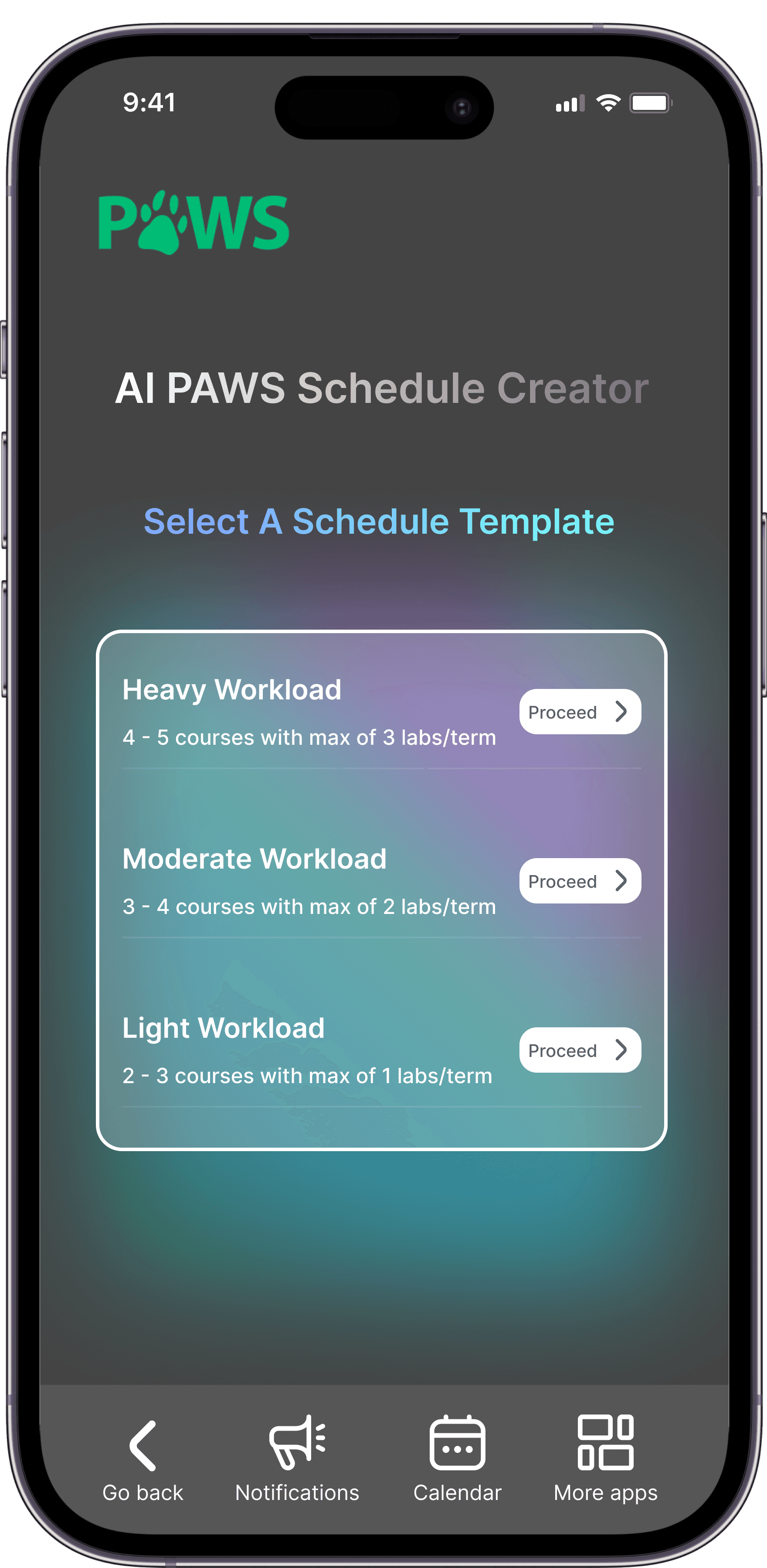
Despite cleaning up the registration interface, students still struggled with the manual search process for classes, which was time-consuming. To address this, I simplified the UI to focus solely on the date and time of the course, as well as implemented a degree-based search (to show relevant courses based solely on their degree), and AI scheduler to build a schedule catered around the users personal preferences.
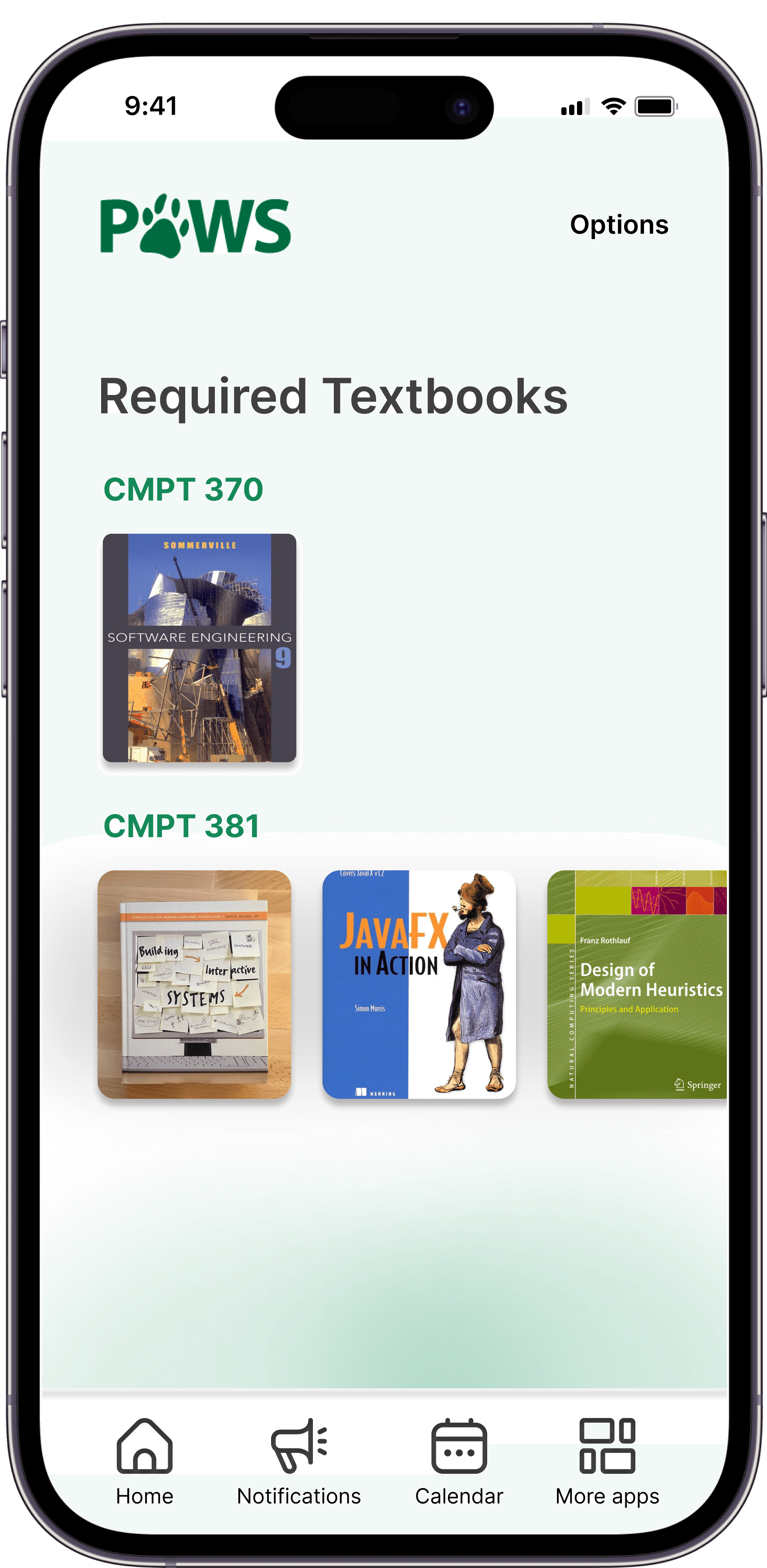
Additionally, students felt the app lacked originality between features, so I made visually important features, like textbook searches, more prominent. I also refined the UI by replacing the floating navigation bar with a flat design and removing text drop shadows to enhance readability and minimize distractions.
I also moved to a flatter design with respect to the home nav bar, as through user feedback and testing, proved to be distracting especially when scrolling through content.
Registration Changes
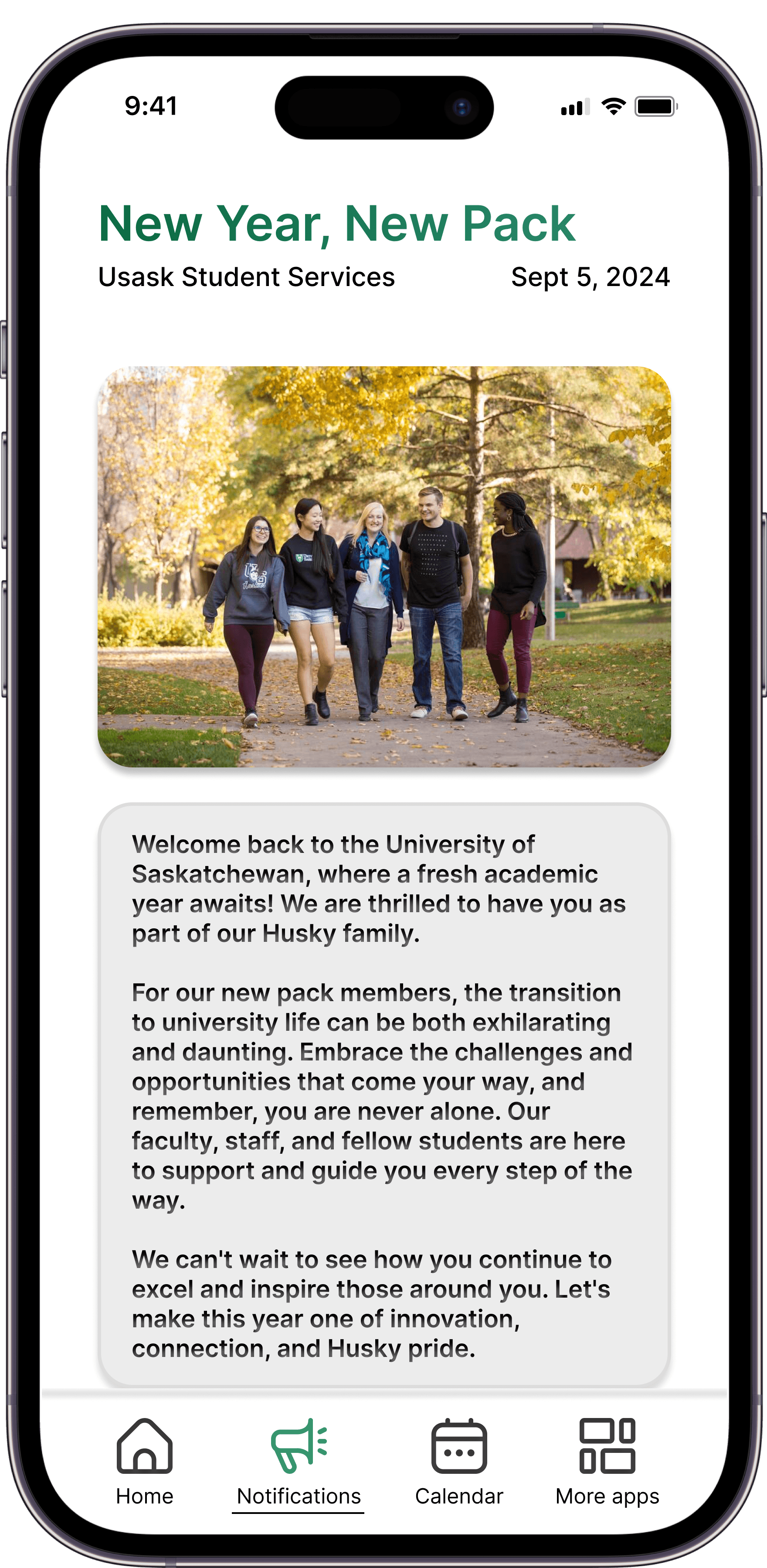
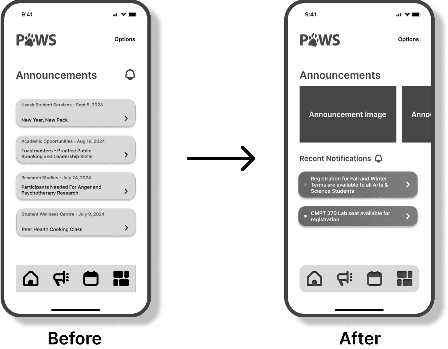
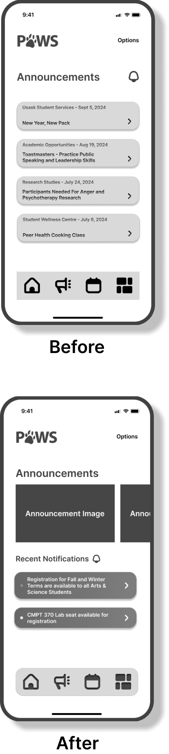
Announcements
Navbar Change
Visual Design & Style Guide
I retained the University of Saskatchewan’s signature greens, whites, and greys to maintain brand consistency while modernizing the interface. This approach balanced familiarity with a refreshed look, ensuring a cohesive and accessible design. The colour palette, typography, and iconography were carefully chosen to enhance readability and user interaction, aligning with the university’s visual identity while delivering an improved user experience.